

Wallpaper's Role in Layered Interiors: Designer Guide
Wallpaper is the layer that adds immediate texture, pattern, and perceived depth to a room in ways paint alone cannot replicate. Used well, it anchors a room’s entire design narrative and gives every other layer, from drapery to furniture finishes, something to respond to. This guide covers practical rules, room-level recipes, placement logic, and sourcing tips so you can specify wallpaper with confidence.
Wallpaper delivers five core outcomes in a layered scheme:
- Tactile depth: Textured surfaces (grasscloth, embossed, woven) add physical dimension the eye reads as richness.
- Pattern hierarchy: A dominant wallpaper pattern organizes supporting patterns in textiles and rugs.
- Spatial definition: Placement choices (feature wall, ceiling, alcove) shape perceived room size and proportion.
- Mood anchoring: Color and scale set the emotional register that all other layers follow.
- Scale manipulation: Large-scale patterns expand space; micro-patterns add detail without visual noise.
Wallsneedlove products carry GREENGUARD Gold certification, meaning they meet strict chemical emission standards for residential and commercial use.
Table of Contents
- Why wallpaper is a strategic layer, not just a background finish
- What each wallpaper type contributes to a layered scheme
- How to layer wallpaper with textiles, furniture, and finishes
- Where to place wallpaper and how much coverage to use
- How to choose color, pattern scale, and contrast for a layered palette
- Practical considerations: installation, durability, and removal
- When should you choose wallpaper instead of paint?
- How Wallsneedlove supports layered interior schemes
- Pro tips and common mistakes when layering wallpaper
- Key Takeaways
- The case for letting wallpaper lead
- Wallsneedlove makes layered schemes practical to execute
Why wallpaper is a strategic layer, not just a background finish
Wallpaper has moved from background to primary design tool. Designers now use it to dictate a room’s narrative arc and mood, then build every other layer around it. That shift changes how you specify it: wallpaper is chosen first, not last.
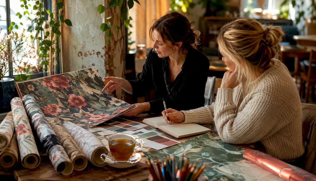
When wallpaper leads, it sets the undertone for upholstery, the repeat scale for rugs, and the finish direction for hardware. Fabrics and furniture become supporting cast. Without that anchor, layered rooms often feel assembled rather than designed.
The practical implication: choose your wallpaper before finalizing any textile or furniture order. Pull the palette, the scale, and the mood from the paper, then build outward. That sequence is what separates a layered room from a decorated one. Understanding how wallpaper changes room atmosphere is the first step in that process.
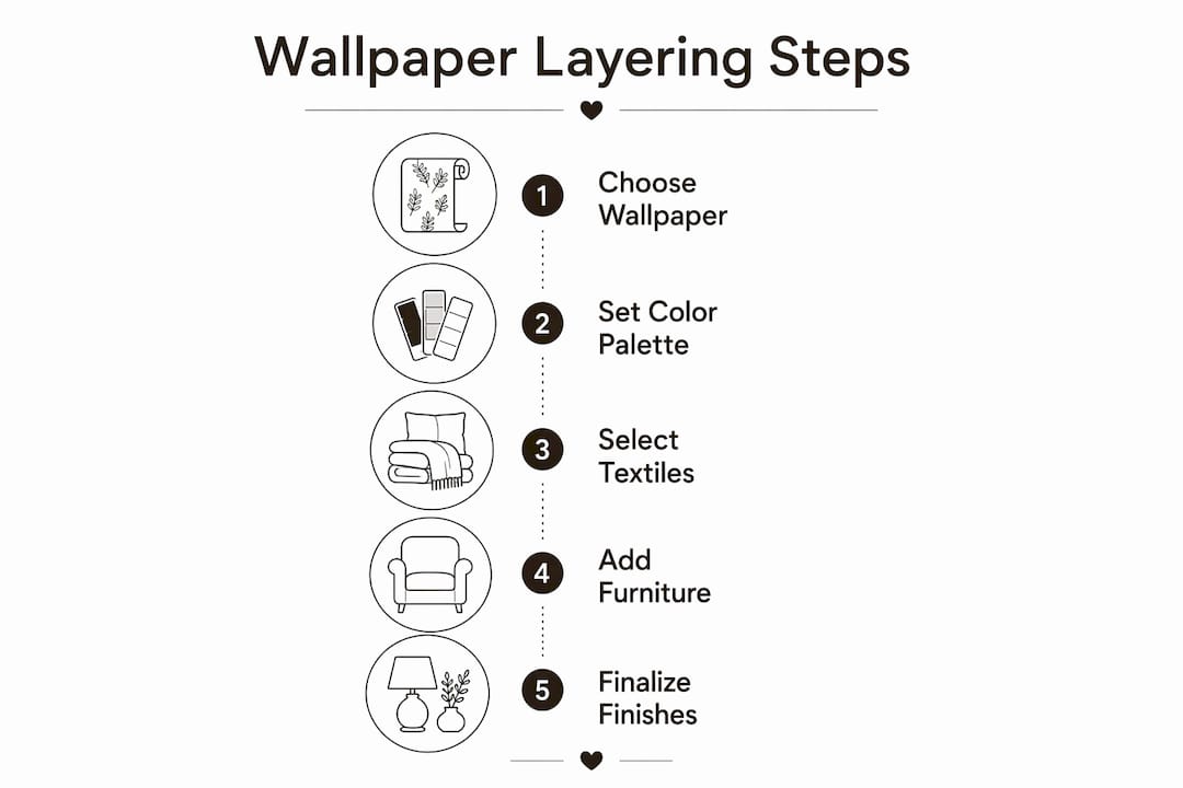
What each wallpaper type contributes to a layered scheme
Pick your wallpaper type based on the specific layered effect you need: tactile warmth, dimensional relief, or visual depth. Each material category delivers a different outcome.
- Grasscloth and woven: Irregular weaves create tactile depth and organic warmth that pairs naturally with wood, jute, and linen. Best for living rooms and bedrooms where warmth is the goal.
- Embossed and 3D relief: Adds dimensional shadow lines without pattern. Works as a neutral anchor that reads as texture rather than print.
- Vinyl and non-woven: Durable, moisture-resistant, and cleanable. Suited to kitchens, bathrooms, and high-traffic commercial spaces.
- Scenic murals: Large-scale murals shift focal hierarchies and visually extend space. They function as the dominant layer and require simpler supporting elements.
- Faux mineral and stone: Delivers the visual weight of stone without the cost or structural load. Pairs well with metal fixtures and concrete accents.
- Metallic and sheen finishes: Reflective surfaces change character under different light sources, adding movement to a static wall.
| Type | Visual/Tactile Contribution | Installation Note | Durability |
|---|---|---|---|
| Grasscloth / woven | Organic warmth, tactile texture | Paste only; seams visible by design | Moderate; avoid high humidity |
| Embossed / 3D relief | Dimensional shadow, neutral depth | Paste or non-woven peel-and-stick | High |
| Vinyl / non-woven | Clean pattern, moisture-resistant | Peel-and-stick or paste | High; scrubbable |
| Scenic mural | Depth, focal dominance | Panel-matched paste or peel-and-stick | High with proper substrate |
| Faux mineral / stone | Visual weight, material contrast | Peel-and-stick or paste | High |
| Metallic / sheen | Light movement, glamour | Paste preferred for flat adhesion | Moderate; shows surface flaws |
Finish and lighting note: Matte finishes absorb light and read as recessive, which adds perceived depth. Sheen finishes reflect light and advance visually, which can highlight drywall imperfections. In rooms with strong directional light, high-sheen papers should be applied selectively. Explore current faux finish layering options for rooms where texture is the primary goal.
How to layer wallpaper with textiles, furniture, and finishes
Start with hierarchy: assign one wallpaper as the anchor pattern and let every other layer support it. Successful layering assigns a dominant and a supporting pattern and avoids giving equal visual weight to competing elements.
Core mixing rules:
- Scale contrast: Pair a large-scale wallpaper with small-scale textile prints, or vice versa. Matching scales create visual competition.
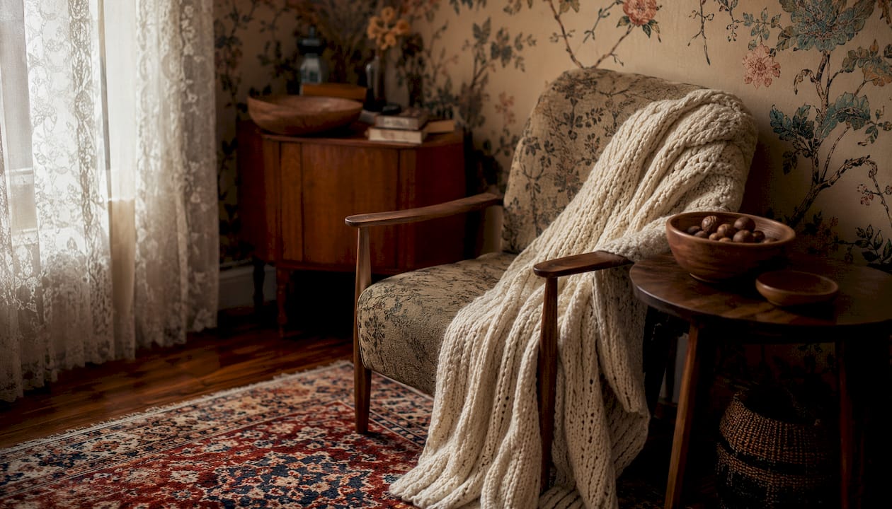
- Texture contrast: Combine smooth wallpaper with nubby upholstery, or textured grasscloth with sleek lacquered furniture.
- Tonal anchoring: Pull one color from the wallpaper and repeat it in at least two other layers (a cushion, a rug, a lamp base).
- Breathing room: Introduce solids or stripes as visual relief when mixing multiple patterns so the eye can rest.
Room recipes:
- Living room (modern): Large-scale geometric wallpaper (anchor) + solid linen sofa + mid-scale geometric rug in a pulled accent color + one stripe cushion for relief. Keep wood tones warm to echo the paper’s undertone.
- Bedroom (traditional): Medium-scale floral wallpaper (anchor) + solid velvet headboard in the paper’s deepest tone + sheer drapery in the lightest tone + embroidered throw with one motif from the paper.
- Powder room (eclectic): Full-room scenic mural (anchor) + single brass fixture + white ceramic basin + no additional pattern. The mural carries the room; everything else recedes.
- Home office (contemporary): Faux-wood grain wallpaper on one wall (anchor) + solid upholstered chair + open shelving in a contrasting dark finish + one geometric desk accessory to echo the paper’s linear quality.
- Dining room (layered): Embossed textured wallpaper (anchor) + linen drapery in a neutral pulled from the paper + mixed-material chairs (wood + upholstered seat) + a statement pendant that echoes the paper’s finish direction.
Pro Tip: When coordinating wallpaper with flooring, treat the floor as a fourth layer. Matching flooring to your existing decor by undertone (warm vs. cool) prevents the wallpaper from reading as isolated.
Where to place wallpaper and how much coverage to use
Placement governs perceived depth. A feature wall creates intimacy and focal hierarchy; full-room coverage creates immersion and spatial continuity; ceiling application adds drama and draws the eye upward.
- Feature wall: Best behind a headboard, fireplace, or sofa. Aligns with primary sightlines and strengthens visual hierarchy without committing to full coverage.
- Full room: Creates an enveloping effect. Works best with medium-scale or textured papers that don’t overwhelm at 360 degrees.
- Ceiling: Adds unexpected depth, especially in rooms with low ceilings where a sky, cloud, or geometric pattern creates vertical lift.
- Alcoves and built-ins: Wallpaper inside cabinetry or shelving units adds depth and color without covering large surface areas. A low-commitment way to introduce bold pattern.
- Framed panels: Wallpaper installed within panel molding reads as curated art rather than full coverage. Painted millwork acts as a visual buffer. See the guide to framing wallpaper as oversized art for execution details.
Scale and proportion rules: A pattern repeat larger than 18 inches can overwhelm a wall under 10 feet wide. Micro-patterns work in busy rooms where multiple layers already compete. Large-scale murals and oversized patterns increase perceived room depth and work well when balanced with simpler supporting layers. For open-plan spaces, use sightline coordination to decide where wallpaper starts and stops across connected zones.
Architectural transitions such as doorways, crown molding, and built-in millwork are natural breakpoints for changing papers. Use them to create gentle transitions rather than hard divisions. Pairing wallpaper transitions with updated interior door designs reinforces the architectural logic of each zone change.
How to choose color, pattern scale, and contrast for a layered palette
Choose wallpaper by its role first: dominant, supporting, or accent. That role determines the color intensity and pattern scale you need.
Pattern scale guidelines:
- Micro-scale (repeat under 3 inches): Reads as texture from a distance. Use as a supporting layer or in small rooms where a larger repeat would fragment.
- Medium-scale (3–12 inch repeat): The most versatile. Works as anchor or support depending on contrast level.
- Macro-scale (over 12 inches): Commands attention. Use as the dominant anchor and keep all other patterns at micro or medium scale.
Mixing three scales successfully: Assign one macro, one medium, and one micro pattern across wallpaper, upholstery, and rug. Keep all three in the same color family with one accent color that appears in each.
Palette extraction steps:
- Identify the wallpaper’s undertone (warm, cool, or neutral).
- Pick two neutrals from the paper to use on large surfaces (sofa, drapery, floor).
- Pick one accent color from the paper and repeat it in at least two accessories or textiles.
Lighting shifts perceived color significantly. A warm-toned paper under cool LED light can read as gray-green. Always test wallpaper samples at home under the room’s actual light sources before committing to full coverage.
Practical considerations: installation, durability, and removal
Match product type and installation method to the room’s use and how long you need it to last.
Installation options:
- Peel-and-stick: Repositionable, renter-friendly, and suitable for smooth drywall. Best for feature walls, temporary installs, and renters. Lead time from Wallsneedlove spans a few business days from order.
- Traditional paste: More permanent, better adhesion on textured substrates, and preferred for full-room coverage in high-humidity spaces. Requires proper wall prep.
- Custom murals (panel-matched): Ordered to exact wall dimensions. Requires precise measurement before ordering. Wallsneedlove produces custom murals within 1–3 days.
Maintenance by material:
- Vinyl and non-woven: wipe clean with a damp cloth; scrubbable surfaces handle kitchen and bathroom use.
- Grasscloth and natural fiber: dust only; moisture causes staining and fiber damage.
- Peel-and-stick: spot clean with a dry or lightly damp cloth; avoid soaking seams.
Removal and layering cost: Multiple layers of wallpaper significantly increase removal time, risk of drywall damage, and labor cost. Each additional layer adds adhesive that requires steaming or chemical treatment to release. For spec decisions, this means choosing peel-and-stick for spaces likely to be refreshed within five years, and paste only where the installation is intended to be long-term. Review common installation mistakes before starting any paste application.
Professional installation is recommended for full-room paste applications, pattern-matched murals, and any space with irregular walls or high ceilings. For straightforward peel-and-stick feature walls, the where to start when wallpapering guide covers the planning steps clearly.
When should you choose wallpaper instead of paint?
Choose wallpaper when you need texture, pattern, or depth that paint cannot provide. Choose paint when long-term repairability and low maintenance are the priority.
Choose wallpaper when:
- The room needs tactile texture (grasscloth, embossed) that paint cannot replicate.
- A focal wall requires pattern or a scenic element to anchor the design.
- You want to manipulate perceived room size through scale or mural depth.
- The space is a powder room, bedroom, or dining room where durability demands are moderate.
Choose paint when:
- The surface will take regular physical contact (hallways, children’s play areas).
- Budget requires easy, low-cost touch-ups over time.
- The room’s design relies on color alone, with texture coming from textiles and furniture.
Combine both when:
- Wallpaper within framed panel molding, with painted millwork as a buffer.
- Wallpaper on one feature wall, painted walls on the remaining three.
- Wallpaper behind open shelving or a gallery wall, where the paper reads as a layered backdrop.
Wallpaper provides textural and pattern depth not reproducible by paint, but paint remains more repairable and lower maintenance over decades. The strongest layered rooms often use both.
How Wallsneedlove supports layered interior schemes
Wallsneedlove offers the product range and practical support that make wallpaper-led layering feasible for both designers and homeowners.
Product capabilities:
- Custom-printed wallpaper and wall murals in floral, geometric, watercolor, scenic, faux texture, and kids’ design categories.
- Available in peel-and-stick or traditional paste formats.
- GREENGUARD Gold certified, meeting strict indoor air-quality standards for residential and commercial spaces.
- Custom murals produced within a short turnaround time from order.
Practical support:
- Sample ordering available so you can test color, scale, and texture under real room conditions before committing.
- Installation guides covering peel-and-stick application, paste methods, and panel-matched murals.
- Design guides for specific use cases including open-plan spaces, feature walls, and framed panel applications.
- Collaborations with local artists, giving designers access to original patterns not available through standard commercial suppliers.
For layered schemes, the ability to order samples and test them against existing furnishings and lighting is the most practical first step. Wallsneedlove’s faux wood grain wallpaper is one example of a product that adds organic depth without requiring real wood, making it a useful anchor layer in contemporary and transitional rooms.
Pro tips and common mistakes when layering wallpaper
The most common failure in layered wallpaper schemes is too many competing elements at equal visual weight. Fix it with clear hierarchy and deliberate breathing room.
Do / don’t checklist:
- Do assign one dominant pattern and limit supporting patterns to lower contrast or smaller scale.
- Do test samples at home under the room’s actual lighting before ordering full coverage.
- Do use architectural transitions (doorways, molding, built-ins) as natural stopping points when mixing two papers.
- Do introduce at least one solid or stripe as visual relief in complex multi-pattern rooms.
- Don’t mix two macro-scale patterns in the same room. One always needs to recede.
- Don’t skip wall prep. Uneven surfaces telegraph through peel-and-stick and paste applications alike.
- Don’t evaluate wallpaper color under store or screen lighting. It will read differently on the wall.
- Don’t ignore sightlines. A bold paper visible from three rooms in an open plan becomes the dominant element of all three.
Pro Tip: Frame a single panel of wallpaper as oversized art to test a bold pattern in a room before committing to full coverage. It controls visual weight, gives you a real-scale preview, and works as a standalone design element if you decide not to wallpaper the full wall.
Key Takeaways
Wallpaper functions as the primary anchor layer in a layered interior, setting the pattern hierarchy, color palette, and textural direction that all other elements follow.
| Point | Details |
|---|---|
| Assign hierarchy first | One dominant wallpaper pattern anchors the room; all textiles and finishes support it at lower contrast or smaller scale. |
| Match type to effect | Choose grasscloth for tactile warmth, murals for depth, vinyl for durability, and embossed for neutral dimension. |
| Placement drives perception | Feature walls create focal hierarchy; full-room coverage creates immersion; ceiling application adds vertical lift. |
| Test before committing | Order samples and evaluate under the room’s actual lighting and next to key furnishings before specifying full coverage. |
| Wallsneedlove execution | Custom murals, peel-and-stick, and paste options with GREENGUARD Gold certification and 1–3 day production turnaround. |
The case for letting wallpaper lead
Most rooms are designed from the furniture out, with wallpaper added at the end to fill the space. That sequence produces rooms that look finished but rarely feel designed. When wallpaper leads, the entire composition changes. The paper’s undertone informs the upholstery choice. Its scale sets the rhythm for every pattern that follows. Its texture tells you whether the room wants linen or velvet, raw wood or lacquer. Starting with the wall is not a stylistic preference; it is a structural decision that makes every subsequent choice easier and more coherent. The room recipes in this guide are built on that logic, and they work precisely because the wallpaper is doing the organizing work that designers often leave to furniture.
Wallsneedlove makes layered schemes practical to execute
Custom wallpaper does not have to mean long lead times or complicated ordering. Wallsneedlove prints custom murals and standard wallpaper within 1–3 business days, ships directly, and provides installation guides for both peel-and-stick and paste applications.
For a large-scale mural that demonstrates how depth and focal dominance work in a real room, the Java Mountain wall mural is a strong starting point: a scenic, full-wall format that pairs with simple supporting layers exactly as the room recipes in this guide describe. For a bold, pattern-led feature wall in a playful or eclectic space, the Monkeying Around removable wallpaper shows how a graphic anchor pattern works with solid and stripe supporting layers.
Order samples from Wallsneedlove to test scale, color, and texture in your actual room before committing to full coverage. Browse the full product range and installation resources at wallsneedlove.com.
Useful sources and further reading
- The Art of Using Two Wallpapers in One Room | Vogue — hierarchy, transitions, and pattern-mixing rules from a design editorial perspective.
- Can Patterned Furnishings and Wallpaper Coexist? | House Beautiful — breathing room and printmaxxing strategies from a working designer.
- How Do You Mix Wallpaper With Existing Wall Decor? | Edward Martin — scale, proportion, and material contrast guidance.
- What Are The Most Popular Wallpaper Styles For Modern Interiors? | Edward Martin — material and finish overview with trend context.
- Testing Wallpaper Samples at Home: A Practical Guide | Wallsneedlove — step-by-step sample testing under real lighting and sightlines.
- Wallpaper in Open Plan Spaces: A Designer’s Guide | Wallsneedlove — sightline coordination and feature-wall decisions for open plans.
- Wallpaper Texture vs Painted Walls: 2026 Homeowner Guide | Wallsneedlove — practical trade-offs between wallcoverings and paint.
- Does Multiple Layers of Wallpaper Increase Removal Cost? | Homevison — removal complexity and cost implications for spec decisions.


Leave a comment