

Why Wallpaper Changes Room Atmosphere: A 2026 Guide
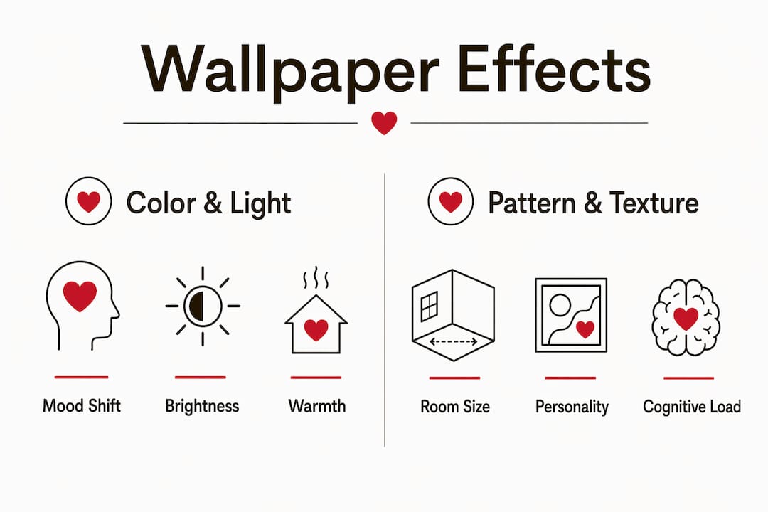
Wallpaper changes a room’s atmosphere by working on perception, not just decoration. Color, texture, and pattern each trigger distinct responses in the brain, shifting how a space feels before a single piece of furniture is moved. Here is what wallpaper actually does to a room at a glance:
- Warmth and coziness: Warm-toned and textured wallpapers make a room feel more inviting than flat paint alone.
- Spatial perception: Light colors open a room visually; dark or dense patterns draw walls inward and create intimacy.
- Mood and energy: Color hues activate different areas of the brain, influencing calm, focus, creativity, or alertness.
- Personality: Pattern and texture give a room a distinct character that neutral walls cannot replicate.
- Visual cohesion: Continuous pattern across all four walls unifies a space; a single accent wall can isolate or define a zone.
These effects are not subjective impressions. Neuroaesthetics confirms that the brain does not simply see a wall. It experiences it, processing color and pattern through the visual cortex, limbic system, and prefrontal cortex simultaneously.
How wallpaper influences warmth and coziness in a room
Color is the fastest signal a room sends. Blue walls produce calm; yellow lifts mood; red raises energy but can tip into anxiety with overuse. Color choices in wallpaper directly link to measurable emotional state changes, with blue and yellow chromatic schemes consistently producing higher positive affect than red or green in controlled studies.
Texture adds a second layer that paint simply cannot deliver. Fabric-like finishes, raised ink patterns, and matte surfaces all reduce glare and make color feel warmer to the eye. A matte wallpaper in a warm neutral reads as softer and more sheltering than the same color in a semi-gloss paint finish. The material finish of wallpaper, whether matte, fabric-like, or metallic, directly changes how light interacts with the wall and how warm or cool the room feels as a result.
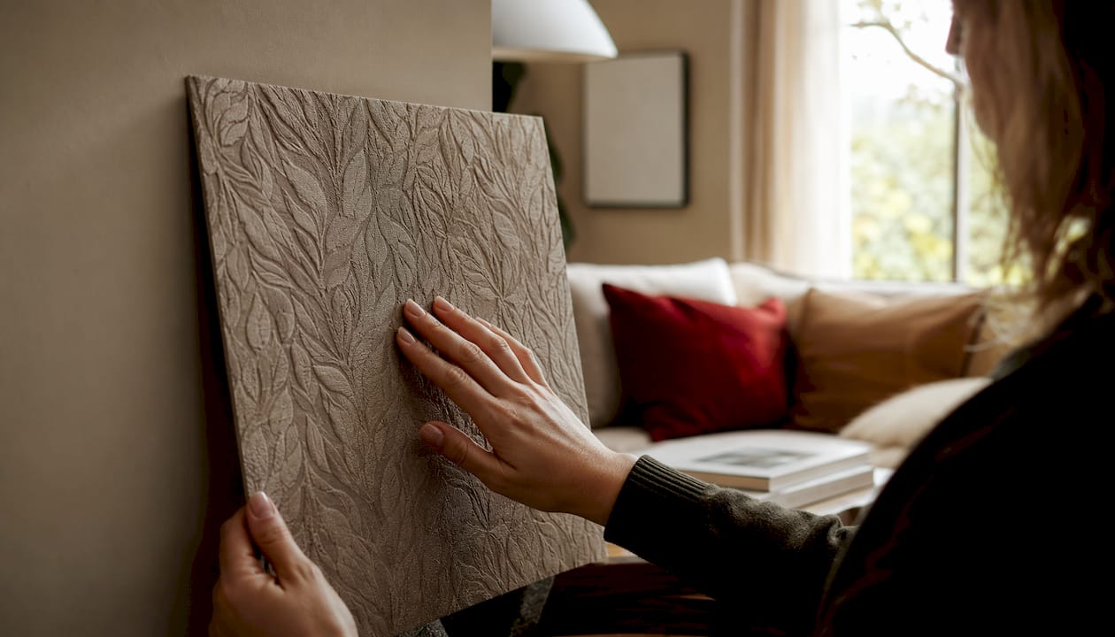
Lighting conditions amplify or dampen these effects. A paper that reads as soft clay in morning light can deepen to a rich terracotta under evening lamps. Checking a wallpaper sample under the actual lighting used in the room, not just in a showroom, is the step most homeowners skip.
For bedrooms and living areas, soft repeats, muted florals, and textile-effect papers work well because they stay comfortable across morning light, evening light, and lamp light. The goal is a pattern that does not compete with the rest of the room but quietly anchors it.
Wallpaper finishes and their warmth effects:
- Matte: Reduces glare, makes color feel deeper and warmer, suits bedrooms and reading rooms.
- Fabric-like: Adds tactile softness, works well with clean-lined furniture to balance hard edges.
- Metallic: Reflects light and adds shimmer, better suited to dining rooms where evening candlelight catches the surface.
- Flocked: Absorbs light with velvety fibers, creates dramatic depth in rooms with excess natural light.
Wallpaper effects on spatial perception: enlarging or shrinking rooms
Pattern scale and color luminance are the two primary tools for controlling how large a room appears. Light-colored wallpaper reflects more light, making rooms feel open and bright, while darker hues absorb light and create a cozier, smaller-feeling space. This is not a stylistic opinion. Research on environmental color identifies luminance as a key variable in arousal and spatial perception.
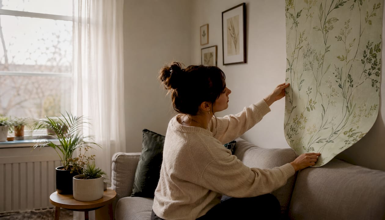
Trompe-l’oeil techniques push this further. Interior designer Maximilian P. Sinsteden recently installed landscape mural wallpaper in a client’s windowless bathroom to add depth and create the illusion of more space. The technique works because the brain reads artistic perspective cues, objects diminishing in size and value as they recede, as genuine spatial depth. A wall becomes a window.
Pro Tip: In a narrow hallway or compact powder room, horizontal stripe wallpaper wraps the perimeter and visually stretches the room’s width. Vertical stripes do the opposite, adding perceived height to low ceilings.
| Pattern type | Spatial effect | Best use case |
|---|---|---|
| Light, small repeat | Opens and brightens | Small bedrooms, narrow hallways |
| Dark, dense pattern | Creates intimacy | Dining rooms, reading nooks |
| Perspective mural | Simulates depth | Windowless bathrooms, accent walls |
| Horizontal stripes | Adds visual width | Narrow rooms, powder rooms |
| Vertical stripes | Adds visual height | Rooms with low ceilings |
| Large-scale scenic | Expands perceived boundary | Living rooms, entryways |
Pattern density also controls how enclosed a room feels. When a pattern lacks negative space around its motifs, the room reads as closed in and intimate. That can be the goal in a cozy reading corner. In a room where openness matters, choosing a pattern with clear background space keeps the walls from advancing visually. Full-wall coverage in small spaces like powder rooms creates visual cohesion and prevents the fragmented look that a single accent wall can produce in a compact footprint.
Professionals also use wallpaper murals to mask utilitarian features. An outlet cover camouflaged within a stone-effect mural, or an awkward corner absorbed into a forest scene, removes visual interruptions that would otherwise break the spatial illusion.
The role of texture and pattern in shaping room personality and atmosphere
Pattern complexity directly affects cognitive load. Neuroaesthetic studies show that symmetrical patterns calm brain activity by offering predictability, while complex or asymmetrical patterns activate curiosity and may enhance creative thinking. High-contrast designs increase alertness but can impair sustained attention over time if the pattern dominates the room without relief.
Wallpaper also directs eye movement. A continuous pattern across all four walls moves the eye around the room in a loop, creating cohesion. A pattern used only on one wall draws the eye to that surface and isolates it as a focal point. Neither approach is wrong. The choice depends on whether the goal is immersion or emphasis.
Texture and pattern effects on room atmosphere:
- Symmetrical geometric patterns: Promote calm and focus; well suited to home offices and bedrooms.
- Organic or asymmetrical patterns: Encourage curiosity and creative energy; good for studios and living rooms.
- High-contrast designs: Energize a space quickly but work best in rooms with short occupancy, like entryways.
- Biophilic motifs (botanicals, wood grain, watercolor landscapes): Reduce stress and restore attention by referencing natural environments.
- Faux textures (linen, plaster, brick): Add tactile warmth visually; haptic printing with raised ink simulates surfaces like low-relief plaster or linen weaves that paint cannot replicate.
- Dense, large-scale patterns: Create bold personality but require a pared-down room to avoid visual overload.
- Small, quiet repeats: Provide texture and interest without demanding attention, allowing furniture and art to lead.
Wallpaper also gives a room personality in a way that paint rarely achieves. A geometric pattern signals order and precision. A loose floral signals ease and softness. A scenic mural signals ambition and a willingness to commit to a point of view. These signals shape how people feel the moment they enter, often before they consciously register the walls at all.
Expert insights from Wallsneedlove on wallpaper impact and 2026 trends
The strongest wallpaper choices in 2026 start with the room’s function and the way light moves through it across the day. A living room needs depth that can hold furniture, art, and varied lighting. A bedroom needs pattern with calm. A dining room can carry richer color because evening light gives deeper tones a natural setting. Wallsneedlove’s approach to selection reflects this room-first logic, with curated collections organized by style, scale, and finish to match specific spatial needs.
Full-room coverage versus a single accent wall is one of the most consequential decisions in any wallpaper project. In compact spaces, wrapping all four walls in the same pattern creates immersion and prevents the visual fragmentation that a single papered wall can produce. In larger rooms, an accent wall behind a bed or sofa creates a clear focal point without overwhelming the space. The right choice depends on pattern scale, color intensity, and how much visual weight the room can carry.
Pro Tip: Before committing to full-room coverage, order a sample and live with it on the wall for 48 hours. Check it in morning light, afternoon light, and under your evening lamps. Color and texture read differently at each hour.
Wallsneedlove produces all wallpaper and murals with Greenguard Gold certification, meaning the products meet strict chemical emission standards for indoor air quality. Orders are custom made within 1–3 days, and the catalog includes peel-and-stick options that make installation accessible without professional help. The collection spans floral, geometric, watercolor, scenic murals, and faux textures, with designs sourced from a network of independent artists.
The dominant trends shaping wallpaper choices in 2026 include warm hues (clay, ochre, warm green, soft brown), texture-rich papers that mimic natural materials, and biophilic motifs drawn from botanicals and landscapes. These directions align with a broader shift in interior design toward surfaces with more visual depth and rooms with a clearer point of view. Flat, neutral walls are giving way to pattern and material that make a space feel considered and complete.
Wallsneedlove’s scenic wall murals and tropical pattern wallpapers are built for exactly this shift, offering large-scale imagery and rich color that change how a room reads from the moment you walk in. Browse the full collection at Wallsneedlove to find the right pattern, finish, and scale for your space.
Key Takeaways
Wallpaper changes room atmosphere by altering color luminance, pattern complexity, and surface texture, each of which triggers distinct responses in the brain’s visual, emotional, and cognitive systems.
| Point | Details |
|---|---|
| Color drives mood directly | Blue and yellow chromatic schemes produce higher positive affect; red overuse increases negative emotional states. |
| Luminance controls perceived size | Light-colored wallpaper reflects more light and makes rooms feel open; dark hues absorb light and create intimacy. |
| Texture adds warmth paint cannot | Haptic printing with raised ink simulates linen or plaster surfaces, adding tactile depth beyond any flat finish. |
| Pattern complexity affects focus | Symmetrical patterns calm brain activity; high-contrast or asymmetrical designs increase alertness or curiosity. |
| Full-room coverage enhances cohesion | Wrapping all four walls in a compact space prevents visual fragmentation and creates an immersive atmosphere. |


Leave a comment