

2026 Wallpaper Trends: Try 3 Samples to Lock in Mood and Texture
The dominant 2026 wallpaper directions are expressive florals and scenic murals, tactile textures like grasscloth and embossed vinyl, sophisticated earthy palettes with mauve making a comeback, refined geometrics, and fresh stripe treatments. The unifying idea: wallpaper is chosen for mood and touch, not just pattern. It’s often applied selectively, such as on ceilings, panels, or powder rooms rather than wall to wall. The guidance below breaks down where each trend fits and how to apply it without guessing.
TL;DR:
- Large-scale botanicals and scenic murals are ideal for main living areas, but smaller, dense florals suit bedrooms and cozy nooks better.
- Texture plays a crucial role, with grasscloth and embossed vinyl adding depth and warmth, especially in dry rooms like bedrooms and dining spaces.
- Pattern sandwiching and selective application help tame bold wallpaper, with tips for coordinating paint and trim colors to create balanced, layered effects.
- Peel-and-stick wallpapers are suitable for renters and testing new designs, but traditional paste-on options last longer in humid environments and textured surfaces.
- Testing samples in natural light is essential, especially for textured and metallic wallpapers, to prevent surprises once they are installed permanently.
Table of Contents
- 2026 Wallpaper Trends at a Glance
- Trend Deep Dives: Colors, Scale, and Pairing Ideas
- Textures and Materials Behind the Look
- How to Apply These Trends Without Overwhelming a Room
- Peel-and-Stick vs. Pasted Wallpaper: What to Know Before You Order
- Our Take: Why Wallpaper Trends Finally Feel Personal Again
- Ready to Try These Trends? Start With a Sample
- Sources
2026 Wallpaper Trends at a Glance
Here’s a fast rundown of the styles shaping walls this year, with a quick note on where each one earns its keep.
- Biophilic maximalism: Large-scale botanicals and jungle-dense leaf prints for living rooms, entryways, and home offices that want a nature reset.
- Cottage cool: Small-scale vintage florals and gingham checks, best in bedrooms and breakfast nooks where a softer, lived-in feel matters.
- Tactile textures and grasscloth: Woven, fibrous surfaces for dens and dining rooms that want warmth without added color.
- Detailed ornamentation and heritage motifs: Damask-adjacent, hand-drawn patterns for formal dining rooms or a study that wants some gravity.
- Sophisticated, muted palettes: Earthy pigments and revived mauve tones for primary bedrooms and hallways that need calm, not noise.
- Fresh stripes and refined geometrics: Updated pinstripes and soft-edged geometric repeats for hallways, closets, and kids’ rooms alike.
- Scenic panels and murals: Full-wall landscapes and botanical scenes for a single accent wall in a living room or over a headboard.
Pair biophilic prints with warm wood trim. Let cottage florals sit against white millwork. Save the boldest heritage motifs for rooms with less foot traffic. Trending pattern galleries can help you see how these repeats actually read at full wall scale before you commit.
Trend Deep Dives: Colors, Scale, and Pairing Ideas
Biophilic maximalism means oversized leaves, ferns, and tropical foliage rendered at a scale you’d never see on fabric. Large-scale botanicals, vintage-inspired florals, and scenic panels rank among the most popular pattern directions for 2026, and the botanical wave is part of that shift, according to House Beautiful’s designer roundup. In a small room, choose a print with more background space so the leaves don’t crowd you. In a great room or stairwell, go bigger. Pull one leaf color, often a deep olive or terracotta, into your trim paint for cohesion.
Cottage cool works the opposite way. Small, dense floral repeats or gingham checks read as inherited rather than trendy. Keep these in bedrooms or breakfast nooks where the scale of the room matches the scale of the print. Oversized cottage florals in a tiny powder room can feel like standing inside a couch cushion.
Detailed ornamentation and heritage motifs bring back damask-style scrollwork and hand-illustrated botanical engravings, executed with a lot more restraint than their maximalist ancestors. Designers describe wallpaper in 2026 as an atmosphere-first choice, selected as much for feel as for pattern, according to Elle Decor. That framing fits ornamentation especially well: a dining room with heritage motifs and warm brass fixtures feels grounded rather than fussy.
Fresh stripes and refined geometrics round out the softer end of the spectrum, more texture and pattern subtlety, replacing the harsh contrast stripes of past years, with palettes trending sophisticated and layered according to Elle Decor’s trend report. A narrow hallway benefits from a vertical stripe in two close tones rather than a stark black and white repeat.
Textures and Materials Behind the Look
Grasscloth, linen weave, and embossed vinyl are doing the heaviest lifting in 2026 rooms, and it’s not incidental. Textural wallcoverings like grasscloth and embossed papers add depth by catching and diffusing light differently than a flat-printed sheet, according to Elle Decor. Metallic thread accents show up in smaller doses, usually in a powder room or hallway, where the light hits at an angle and the shimmer actually registers.
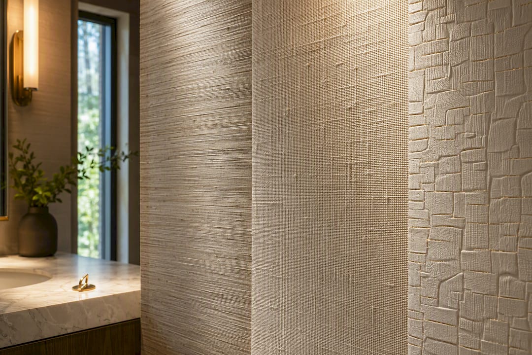
Textural wallpapers act almost like textiles on a wall, which is why they show up so often in bedrooms and powder rooms, spaces built for intimacy rather than traffic, per House Beautiful. Look for Greenguard Gold certification when you’re choosing a wallpaper for a bedroom or nursery. It signals low chemical emissions, which matters more in rooms where people sleep for eight hours a night.
Material choice should follow the room’s humidity, not just its color scheme. Fiber-based textures like grasscloth belong in dry living rooms and bedrooms; for kitchens and bathrooms, choose a coated or vinyl-backed version instead, since raw fiber papers hold moisture and degrade faster in humid air, a distinction Elle Decor’s designers flag directly.
How to Apply These Trends Without Overwhelming a Room
Pattern sandwiching, coordinating a bold wallpaper with painted trim and ceiling color above and below it, is the technique designers keep recommending for taming maximalist patterns into something livable, according to Vogue. It gives homeowners a controlled way into a bigger look without redoing the whole room.
- Pick your wallpaper first, then pull one secondary color from the print, often a muted background tone, for your trim and ceiling paint.
- Apply the paper to the main wall field only, leaving baseboards, crown molding, and door casings in the coordinating paint color.
- If the room has wainscoting, stop the paper at the chair rail instead of running it floor to ceiling.
- For a subtler entry point, wallpaper the ceiling alone and leave the walls a solid color.
Designers increasingly favor selective placement, ceilings, powder rooms, single panels, or the inside of a built-in bookcase, over full-room coverage, according to Good Housekeeping. Small repeats suit tight spaces like closets and hallways; save large-scale botanicals and scenic murals for walls with real square footage to show them off.
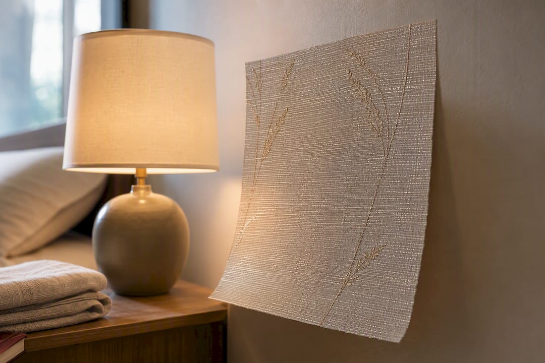
Pro Tip: Tape a printed sample of your wallpaper choice to the wall and look at it in morning and evening light before ordering. Grasscloth and metallics shift dramatically under warm bulb light versus daylight.
Peel-and-Stick vs. Pasted Wallpaper: What to Know Before You Order
Peel-and-stick wallpaper suits renters, accent walls, and anyone testing a bold pattern before committing long-term. Traditional paste-the-wall paper holds up better on textured or heavily trafficked surfaces and tends to last longer in high-humidity rooms once properly sealed.
Before you order full rolls, run through this checklist:
- Order a large sample, not a swatch, so you can judge scale and color accurately.
- Test it in the room at different times of day.
- Check where seams will fall relative to windows and focal points.
- Prep and clean the substrate; peeling paint or old glue residue ruins adhesion.
- Confirm the wall is dry and free of active moisture issues.
- Measure twice, factoring in pattern repeat, before cutting anything.
Hire a professional for multi-panel scenic murals, walls with uneven or textured substrates, or removing old, brittle wallpaper. Good Housekeeping’s installers note that proper substrate prep and careful sample testing prevent most of the seam and alignment problems homeowners run into with large murals.
Our Take: Why Wallpaper Trends Finally Feel Personal Again
Every wallpaper cycle claims to be “more expressive” than the last, but 2026 is different in one real way: the emphasis has shifted from pattern alone to how a paper feels and behaves in a room. That’s a harder thing to fake with a flat print, and it’s why texture, grasscloth, embossing, layered mauve tones, keeps surfacing across every trend list this year.
The practical upside for homeowners is that you no longer need to gut a room to try one of these looks. A removable, custom-printed mural lets you test a large-scale botanical or scenic panel on one wall, live with it, and change course if it’s wrong. Textured papers work the same way for smaller, tactile-first spaces like a powder room or reading nook. Pattern sandwiching, similarly, only works if your wallpaper source can match a print’s undertone to real paint chips, something worth checking before you fall in love with a repeat you can’t actually coordinate.
If you’re drawn to the living-room-specific pairing guidance covered above, start there before shopping. Trend lists are useful for direction. They’re not useful for telling you whether a print will actually work on your wall.
— WallsNeedLove
Ready to Try These Trends? Start With a Sample
Reading about earthy palettes and grasscloth textures only gets you so far. The real test happens on your own wall, in your own light. Order three or four samples of the trends that caught your eye, then use the pattern-sandwiching and scale rules above to see how they hold up against your existing trim and furniture before buying full rolls.
Custom murals and wallpapers are typically produced quickly, so you’re not stuck waiting weeks to see a trend on your own wall. If biophilic maximalism is calling your name, the Monkeying Around removable wallpaper shows how oversized botanicals actually read at full scale. Prefer a scenic panel over a headboard or in a dining nook? The Java Mountain wall mural is built for exactly that placement. You may be able to request a custom mural consultation for help with sizing suited to your actual walls, not a generic repeat.
Sources
This roundup drew on trend reporting from Elle Decor, Good Housekeeping, House Beautiful, and Vogue’s coverage of pattern sandwiching. For color inspiration beyond wallpaper, the 2026 IKEA Style Guide offers a useful cross-check on broader interior color direction.
- These Are the Wallpaper Trends Taking Over in 2026, According to Experts
- The Biggest Wallpaper Trends for 2026, According to Designers
- The Top 10 Interior Design Trends That Will Rule 2026, According to Designers
- Meet pattern sandwiching: the maximalist interior design trend giving rooms more personality


Leave a comment