

Designers: Floral Wallpaper Trends: 48 hour test before ordering
Four categories dominate right now: dainty vintage-inspired prints, earthy botanicals, dense “blooms in abundance” repeats, and bold modern naive florals. The rule that ties them together is scale management: small prints work as texture and belong almost anywhere, while large-scale blooms create drama and read best on a single accent wall or as a mural. Test every sample in your own room, in both morning and evening light, before committing to a full wall.
TL;DR:
- Dark-ground florals and dense blooms require careful lighting checks because they can appear flat or muddy under different light conditions.
- Large-scale floral prints are best suited for spacious rooms like living or dining areas where their drama can be appreciated from a distance.
- Sampling a wallpaper in both morning and evening light and living with it for 48 hours helps ensure fabric and color choices suit the room’s natural and artificial lighting.
- Vinyl and wipeable finishes are ideal for kitchens and bathrooms, whereas peel-and-stick options are suitable for renters or quick tests on bold, intricate patterns.
- Matching floral patterns to existing room elements, like floors or cabinetry, prevents visual conflicts and enhances the overall harmony of the space.
Table of Contents
- Floral Wallpaper Trends Worth Knowing in 2026
- How to Choose Floral Wallpaper: Placement, Scale, and Pattern Mixing
- Choosing a Color Palette That Works With Your Room
- Materials and Finishes: Matching the Wallpaper to the Room
- Room-by-Room Floral Wallpaper Ideas
- Sourcing On-Trend Florals Through Wallsneedlove
- Where Today’s Floral Trends Actually Come From
- Keeping Floral Wallpaper Looking Sharp Over Time
- Designers and Brands Shaping the Floral Wallpaper Conversation
- Digital Printing and the New Floral Wallpaper
- Adopting Florals Without Regretting It in Two Years
- Order Samples Before You Commit to a Wall
- Sources
- FAQ
Floral Wallpaper Trends Worth Knowing in 2026
Each floral direction serves a different room and a different mood. Knowing the visual cues of each one saves you from ordering a sample that looks nothing like you pictured once it’s on the wall.
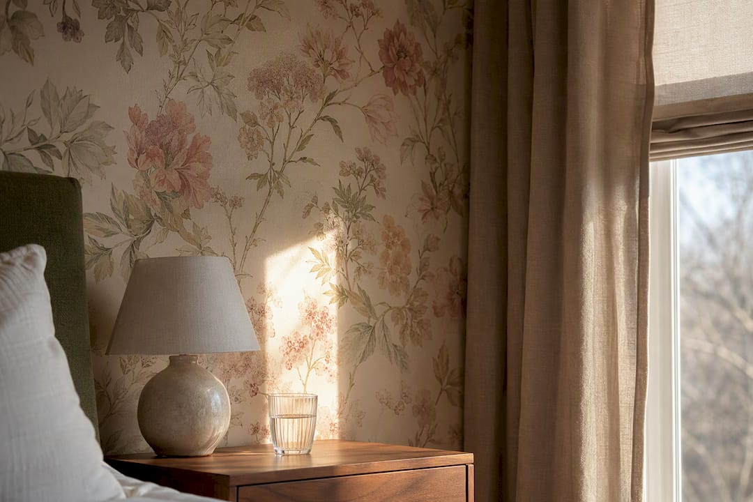
Dainty and archival-inspired prints. These are small-scale, closely spaced florals pulled from old textile archives and softened into muted, faded colorways: dusty rose, sage, buttermilk. They read as texture from across a room rather than as a bold pattern, which makes them forgiving in small bedrooms, powder rooms, and hallways where you want warmth without visual noise. Editorial trend coverage for 2026 points to this heritage-motif revival as one of the year’s clearest through-lines: nostalgic patterns rebuilt in contemporary palettes so they feel fresh instead of dated.
Earthy botanicals. Think loose stems, leafy repeats, and single-species prints like ferns, eucalyptus, or olive branches rather than dense floral clusters. These patterns pair naturally with wood tones, linen upholstery, and matte ceramics, which is why they’ve become a favorite for kitchens, dining nooks, and home offices where a botanical wants to feel grounded rather than decorative.
Blooms in abundance. This is the maximalist end of the spectrum: dense, layered repeats with little negative space, often built around meadow or garden motifs. Used well, they turn a wall into the room’s focal point. Used carelessly, they overwhelm a small space fast. Practical wallpaper guidance recommends treating these dense murals like large-scale artwork: keep the furniture simple, keep the trim quiet, and let the pattern carry the room.
Bold and modern naive florals. Oversized petals, saturated color blocking, and hand-drawn or painterly linework define this category. It’s color-led maximalism, and it works best in spaces built to make a statement: a dining room, a powder room, or a stairwell where you pass through rather than linger for hours.
Painterly, watercolor, and tonal florals. Soft-edged brushwork and monochrome or near-monochrome palettes give you the movement of a floral print without the contrast punch. These suit bedrooms and living rooms where you want texture and depth but not a pattern competing with artwork or textiles.
Mini-trends worth watching. Floral-geometry hybrids, where blooms sit inside diamond or grid structures, are showing up more in transitional spaces. Dark-ground florals, pale flowers set against black, navy, or forest backgrounds, are having a real moment in powder rooms and accent walls, though they demand careful lighting checks before you commit (more on that below). If you want a broader read on where floral sits against other current patterns, this rundown of trending wallpaper styles walks through the wider landscape.
- Dainty archival prints: small scale, muted tones, forgiving in tight spaces.
- Earthy botanicals: single-species stems, pairs with natural materials.
- Blooms in abundance: dense repeats, best as a focal wall, not a whole-house pattern.
- Bold modern naive: saturated color, best in transitional rooms or statement rooms.
- Painterly and tonal: soft contrast, good for bedrooms and living rooms.
- Dark-ground florals and floral-geometry hybrids: high impact, test lighting first.
How to Choose Floral Wallpaper: Placement, Scale, and Pattern Mixing
Before you order a single roll, decide whether you’re committing to a feature wall or a full room. A feature wall is the lower-risk choice for bold or dense patterns; full-room coverage, sometimes called pattern-drenching, works best when your palette is restrained and your furniture and trim stay simple. If your sofa, cabinetry, and window treatments are already busy, a feature wall almost always reads better than four walls of the same print.
Match pattern scale to the room’s sightlines, not just its square footage. Small florals disappear as texture from six feet away, so they work in a hallway you walk through quickly or a small bathroom. Large-scale blooms need distance to be appreciated, which is why they suit living rooms, dining rooms, and primary bedrooms with generous wall space.
Sampling matters more than most people budget time for. Here’s a routine that actually works:
- Order a physical sample, not just a screen preview.
- Tape it to the wall you’re considering, not a random spot in the house.
- View it in direct morning light and again after sunset with your usual lamps on.
- Step back at least six feet to judge how the pattern reads at a distance, not just up close.
- Live with it for at least 48 hours before ordering the full order.
That lighting check isn’t optional for dark-ground florals. Designers routinely test samples this way because lighting shifts how contrast and color read, and a dark-ground print that looks crisp and moody at night can turn flat or muddy under midday sun.
If you’re mixing florals with other patterns, anchor the room with one dominant print and let stripes, solids, or geometrics play a supporting role, ideally through pillows, a rug, or a lampshade rather than a second wall. Keep the color palette shared across both patterns so the mix feels intentional instead of accidental.
Pro Tip: Patch and prime your wall before hanging anything with a busy repeat. Uneven texture underneath a dense floral print will telegraph through the pattern in ways a solid color never shows.
For a deeper walk-through of scale and placement decisions by room, this guide to using floral wallpaper covers the specifics.
Choosing a Color Palette That Works With Your Room
Start with what you can’t change: flooring, cabinetry, and large upholstered pieces. Pull two or three colors from those fixed elements and look for a floral print that echoes at least one of them. A wallpaper that ignores your existing floor tone will fight the room no matter how much you love the pattern in isolation.
High-contrast florals, think deep green stems against a cream ground, work well as statement walls but can feel busy across an entire room. Tonal florals, where the pattern sits close in value to its background, give you texture and movement without demanding attention, which makes them safer for full-room coverage.
Dark-ground florals deserve a specific caution. They can anchor a small powder room beautifully, but in a room with limited natural light, they risk feeling cave-like rather than cozy. Balance a dark-ground wall with lighter trim, ceiling paint a shade or two lighter than the wallpaper’s background, and enough artificial lighting to keep the pattern legible after dark.
- Pull your base palette from floors, cabinetry, or a large sofa before choosing a print.
- Use high-contrast florals as accent walls; save tonal prints for full rooms.
- Pair dark-ground wallpaper with lighter trim and stronger lighting.
- Photograph your sample at two different times of day and compare the images side by side.
Color perception genuinely shifts with the light source in the room. Design guidance on lighting and pattern confirms that the same wallpaper can read as warm and inviting under lamp light and noticeably cooler or grayer under overhead fluorescents, which is exactly why a quick phone photo in two different lighting conditions is worth the two minutes it takes.
Materials and Finishes: Matching the Wallpaper to the Room
Peel-and-stick, non-woven, and traditional vinyl each solve a different problem. Peel-and-stick is the easiest for renters or anyone testing a bold print before fully committing, since it removes cleanly without damaging paint. Non-woven wallpaper is a strong middle ground for homeowners who want a more permanent installation but still prefer a straightforward, paste-the-wall application. Vinyl holds up best in high-humidity or high-traffic rooms because it wipes clean, which makes it the practical choice for modern cat furniture considerations when selecting kitchen backsplashes and bathroom walls near a tub or shower.
Finish matters more than most shoppers expect. A matte finish hides wall imperfections and minimizes glare under strong lighting, while a slight sheen can make a dense floral print feel more luxurious but will also show every seam and bubble if installation isn’t clean.
Print resolution deserves attention too, especially with dense, detailed florals where muddy printing turns intricate botanicals into a blur. Higher-resolution digital printing keeps individual petals and leaf veins crisp even at large mural scale.
- Peel-and-stick: easiest DIY option, ideal for renters and sample testing.
- Non-woven: durable, straightforward paste-the-wall application.
- Vinyl: best for kitchens and bathrooms because it wipes clean.
- Look for Greenguard Gold certification if indoor air quality is a priority in bedrooms and nurseries.
Material suitability by room is worth reviewing in more detail if you’re weighing durability against installation effort, particularly for a kitchen or bath project where cleanability outweighs everything else.
Room-by-Room Floral Wallpaper Ideas
Bedrooms reward either extreme: a full mural wrap for real drama, or a single headboard wall if you want the floral print contained to the space behind your bed. The headboard-wall approach lets you go bolder with color and scale than you might risk on four walls, since the pattern stays visually anchored to one furniture piece.
Living rooms handle larger-scale florals well, especially behind a sofa or on the wall facing your main seating area, because there’s enough distance to appreciate a big repeat. Keep other patterns in the room minimal and let neutral furniture do the anchoring.
Kitchens and bathrooms call for vinyl or a wipeable finish given moisture and grease exposure, and a botanical or earthy print tends to suit these utilitarian spaces better than a dense, formal bloom. An herb-inspired mural works particularly well in a dining nook or kitchen wall that doesn’t take direct splash exposure.
Hallways and small spaces are actually where bold florals shine, since you experience the pattern in passing rather than sitting with it for hours. Full pattern-drenching, floor to ceiling coverage with no breaks, can succeed in a small powder room or entryway specifically because the limited square footage keeps the palette simple by default.
- Bedrooms: mural wrap for drama, headboard wall for a contained statement.
- Living rooms: large-scale florals on the main sightline wall, neutral furniture elsewhere.
- Kitchens and bathrooms: vinyl or wipeable finishes, botanical prints over dense blooms.
- Hallways and powder rooms: bold prints and pattern-drenching work well in small footprints.
- Small spaces overall: stick to one dominant pattern per room and avoid layering two busy prints in tight quarters.
More living-room-specific pairings are covered in this 2026 styling guide if you’re working with an open-concept layout.
Sourcing On-Trend Florals Through Wallsneedlove
Custom-printed floral wallpaper and murals are available in both peel-and-stick and traditional paste formats, which cover the two biggest use cases in this guide: renters or first-time pattern buyers who want the low-risk peel-and-stick option, and homeowners ready for a permanent, full-room installation. Orders are typically produced quickly, so a sample or a full mural doesn’t sit in a production queue for weeks while you wait to see how a print reads on your wall.
- Bold, modern naive florals and dense meadow motifs translate well into mural format, like the tropical botanical mural style covered above.
- Dainty, archival-inspired prints are well suited to peel-and-stick for easy testing and removal.
- Order a physical sample before committing to a full room, and check it against the lighting routine covered earlier in this guide.
- Review installation prep guidance before your first DIY hang.
Where Today’s Floral Trends Actually Come From
Floral wallpaper isn’t a new idea reinventing itself. It’s a centuries-old decorative tradition cycling back with better printing and looser rules. The hand-blocked florals of 18th-century European interiors gave way to the dense, saturated Victorian florals that later became a design punchline in mid-20th-century America, all cabbage roses and dark, cluttered repeats.
The backlash against that look is exactly why floral wallpaper spent decades being treated as dated or fussy. What’s changed in the current revival is editing: today’s archival-inspired prints borrow the linework and motifs from those historical patterns but strip out the clutter, lighten the palette, and give the repeat room to breathe. That’s the difference between a Victorian cabbage rose wall and a 2026 dainty vintage print pulled from the same design lineage.
Botanical illustration has its own separate history worth noting, rooted in 19th-century scientific plant documentation rather than decorative textile design. That lineage is why earthy botanical wallpaper today often looks more like a naturalist’s field sketch than a traditional floral repeat: single stems, precise linework, minimal color. Two historical threads, decorative florals and scientific botanicals, are now converging in the same wallpaper catalogs, which explains why 2026’s floral trends feel more varied than any single decade that came before.
Keeping Floral Wallpaper Looking Sharp Over Time
Most floral wallpaper damage comes from moisture, direct sun exposure, and rough cleaning rather than the material simply wearing out. Dust walls regularly with a soft, dry microfiber cloth to prevent buildup that dulls the print over time, especially in dense, detailed patterns where dust settles into the texture of the print.
For vinyl or wipeable finishes in kitchens and bathrooms, a damp cloth with mild soap handles most spills and splatters without damaging the pattern. Avoid abrasive sponges or strong solvents on any wallpaper, since they can strip color from the print layer even on durable materials. Peel-and-stick wallpaper is generally more forgiving of light cleaning than traditional paste-applied paper, but neither should be scrubbed hard.
Direct, prolonged sun exposure fades floral prints faster than almost any other factor, particularly on south-facing walls. If a wall gets strong afternoon light, consider window treatments or accept that a bold, saturated floral may mellow in tone over a few years, which is sometimes not a bad thing on an heirloom-style print.
Check seams and edges periodically, especially in humid rooms, since lifting corners are far easier to fix with a small amount of wallpaper adhesive when caught early than after months of curling. A floral mural or feature wall installed correctly, with a properly prepped surface underneath, tends to outlast the trend cycle that inspired it in the first place.
Designers and Brands Shaping the Floral Wallpaper Conversation
The floral wallpaper revival isn’t happening in a vacuum. Interior design editorials have spent the past several seasons documenting a real shift toward heritage motifs reworked for contemporary palettes, and that coverage is shaping what shoppers ask for by name. Design guides now walk buyers through choosing floral wallpaper by scale, finish, and room rather than treating it as a single monolithic style, which reflects how fractured, and how personal, floral choices have become.
Independent and boutique wallpaper studios have been especially influential in pushing archival prints back into circulation, often working directly from historical textile archives and reprinting them in updated colorways rather than designing entirely new patterns from scratch. That archival sourcing is part of why so many 2026 florals feel simultaneously familiar and current: the linework is old, the palette is new.
Custom and made-to-order production has also reshaped who gets to set trends. When a wallpaper company can produce a custom print in days rather than weeks, smaller studios and independent designers can react to a seasonal color shift or a client’s specific request almost as fast as larger manufacturers, which has flattened some of the old hierarchy between big legacy wallpaper houses and newer, nimbler print studios.
Digital Printing and the New Floral Wallpaper
The single biggest technical shift behind current floral trends is print resolution. Digital printing lets manufacturers reproduce fine botanical detail, individual petal veins, layered watercolor washes, delicate stem linework, at a scale and clarity that older screen-printing methods couldn’t reliably hit, especially on large mural formats.
That resolution jump is part of why today’s floral wallpapers look noticeably crisper than florals from a decade ago, even when the underlying motif is pulled from a much older archival source. Digital printing also makes custom colorways commercially realistic. A studio can shift a single print from a faded vintage palette to a saturated modern one without retooling an entire production line, which is exactly how the same archival rose print can show up as both a dainty muted wallpaper and a bold, high-contrast statement piece in the same season.
Print-on-demand production has a second, quieter effect: it shortens the gap between a design trend appearing in an editorial spread and that same print becoming available to buy. Custom manufacturing that turns around orders in a few days, rather than the weeks or months typical of traditional wallpaper printing runs, means smaller color and pattern experiments reach shoppers faster, and get replaced faster too if they don’t sell.
Adopting Florals Without Regretting It in Two Years
The mistake most people make with a floral trend is choosing the pattern before deciding how it needs to function in the room. A dense, dark-ground bloom might be exactly right for a powder room you glance at, and completely wrong for a home office you sit in for eight hours a day. Trend cycles favor bold choices; your actual daily experience of a room favors restraint in the wrong spot and boldness in the right one.
Test the sample in your own light before you decide anything else. Match the pattern’s scale to how long you’ll actually look at that wall. Choose a material built for how that room gets used, not just how the wallpaper looks in a catalog photo. Start with one wall if you’re unsure. A feature wall you love is a far better outcome than four walls you’re already tired of by spring.
— WallsNeedLove
Order Samples Before You Commit to a Wall
Every floral direction covered here, from dainty archival prints to bold statement blooms, is available through Wallsneedlove in both peel-and-stick and traditional paste, custom made within 1 to 3 days rather than the weeks a typical wallpaper order takes to ship.
That fast turnaround matters most at the sampling stage, when you’re trying to judge a pattern in your own light before spending on a full room. Every print carries Greenguard Gold certification, which is worth checking for if you’re papering a bedroom or nursery and care about indoor air quality. If bold botanicals are calling to you, the tropical mural collection and large-format options like the Java Mountain mural both work as statement walls without a long wait for production. Browse the full wallpaper and mural collection and order a physical sample for the wall you’re considering before you commit to a full room.
Sources
- Florals, Reimagined: The Floral Interior Trends for 2026 | Piglet in Bed
- Floral Wallpaper for Walls: Styles, Patterns, and Design Ideas - BNO News
- How to use floral wallpaper without overwhelming a room — Edward Martin
FAQ
What are the latest trends in floral wallpaper?
Dainty archival-inspired prints, earthy single-stem botanicals, dense “blooms in abundance” repeats, and bold modern naive florals are the four dominant directions, alongside dark-ground florals and floral-geometry hybrids as smaller mini-trends.
What is the wallpaper trend for 2026?
Beyond florals, 2026 favors larger pattern scales, cleaner spacing between motifs, and material choices matched specifically to room use, like vinyl for kitchens and peel-and-stick for renters.
What are the floral design trends for 2026?
Heritage motifs reworked in updated, often muted colorways lead the pack, alongside earthy botanical prints and dense meadow-style repeats used as focal-wall statements rather than whole-room coverage.
What kind of wallpaper is trending right now?
Floral wallpaper is trending broadly, but so is high-resolution digital printing that makes detailed botanical prints look sharp even at mural scale, along with peel-and-stick formats that let buyers test bold patterns with less commitment.
Should I choose a feature wall or cover the whole room in floral wallpaper?
Choose a feature wall for bold or dense florals and busy furniture; full-room coverage works best with a restrained palette and simple furnishings, a pattern-drenching approach that keeps small rooms from feeling cluttered.


Leave a comment