

Watercolor Wallpaper Aesthetic Explained for 2026
The watercolor wallpaper aesthetic is defined by soft gradients, organic color bleeds, and matte paper-grain textures that replicate the look of hand-painted watercolor art. Unlike sharp-edged geometric or high-gloss styles, this aesthetic relies on fluid transitions, muted natural tones, and deliberate imperfections that signal handcrafted warmth. It reads as tactile, calm, and personal — a direct contrast to the cold precision of digital-first design. Wallsneedlove, a provider of custom-printed wallpaper and murals with Greenguard Gold certification, offers curated watercolor collections that bring this aesthetic into residential and commercial spaces.
Core visual and emotional characteristics:
- Fluid color transitions with soft, undefined edges
- Muted palettes: dusty pinks, earth tones, indigos, sage, and terracotta
- Matte, paper-grain surface textures that absorb rather than reflect light
- Organic bleeds and pigment variations that mimic wet-on-wet painting
- A visible “human trace” — subtle irregularities that feel intentional, not accidental
- Emotional tone: warm, grounded, and empathetic
Table of Contents
- What the Watercolor Pivot tells you about 2026 design
- How to use watercolor wallpaper effectively in any room
- What to expect from a custom watercolor wallpaper provider
- Wallsneedlove’s watercolor wallpaper collections
- Key Takeaways
What the Watercolor Pivot tells you about 2026 design
The Watercolor Pivot is a 2026 design movement that favors soft edges, organic bleeds, muted natural tones, and matte paper-grain textures over the sharp, glossy aesthetics that dominated earlier years. It emerged as a direct response to what designers call “hard-tech” visual culture: neon colors, high-contrast gradients, and mirror-finish surfaces that prioritize precision over feeling.
The contrast between the two approaches is clear:
| Feature | Hard-Tech Style | Watercolor Pivot |
|---|---|---|
| Edges | Sharp, defined | Soft, organic |
| Color palette | Neon, high-contrast | Muted, natural |
| Texture | Glossy, reflective | Matte, paper-grain |
| Emotional tone | Cold, technical | Warm, empathetic |
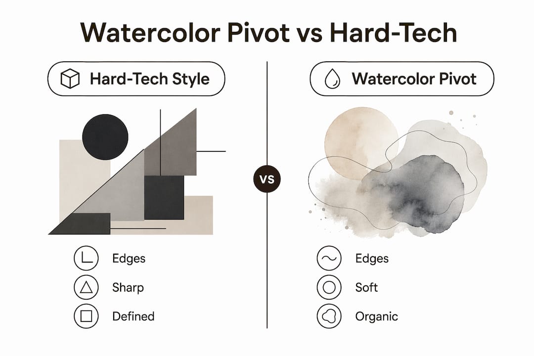
Digital designer Julian Hayes identifies the watercolor aesthetic as an empathetic design response to cold AI realism. The “human trace” — those subtle bleeds and grain variations — signals warmth and care in environments where machine-generated perfection has become the norm. Customers respond to it because it shows effort and individuality, qualities that mass-produced or algorithmically generated design cannot replicate.
The fluid, unpredictable pigment-water interaction that defines watercolor style also drives its appeal in bohemian and organic interiors. No two panels look identical, which gives each installation a soulful, one-of-a-kind quality.
Pro Tip: To achieve tactile depth in digital applications of the watercolor aesthetic, add a high-frequency noise or grain overlay using grain-native CSS frameworks. This lightweight technique replicates the paper-grain texture without heavy image files, keeping performance intact while preserving the handcrafted feel.
How to use watercolor wallpaper effectively in any room
Choosing the right room matters. Watercolor wallpaper brings the most impact in spaces where softness and warmth are the goal: living rooms, primary bedrooms, dining areas, and commercial lobbies. These are environments where people spend time and want to feel at ease. A single accent wall in a bedroom or an entryway mural in a hotel lobby can anchor the entire space.
Color palette selection shapes the mood. Common watercolor wallpaper styles lean on:
- Muted sunset pinks and blush tones for bedrooms and spa environments
- Earth tones and terracotta for living rooms and dining spaces
- Indigo and deep teal washes for commercial or statement walls
- Sage and soft greens for home offices and reading nooks
Pair watercolor wallpaper with neutral or natural-toned furniture. Light oak, linen, raw cotton, and unfinished wood all complement the organic quality of watercolor gradients without competing for attention. Avoid high-gloss or chrome finishes nearby — they clash with the matte, paper-like surface.
One of the most effective techniques for large-scale murals is framing them with molding. Running trim around the mural’s edges turns the wallpaper into a defined architectural feature, hides any seam lines, and presents the piece as a gallery-scale artwork rather than standard wall treatment. This works especially well in entryways and dining rooms.
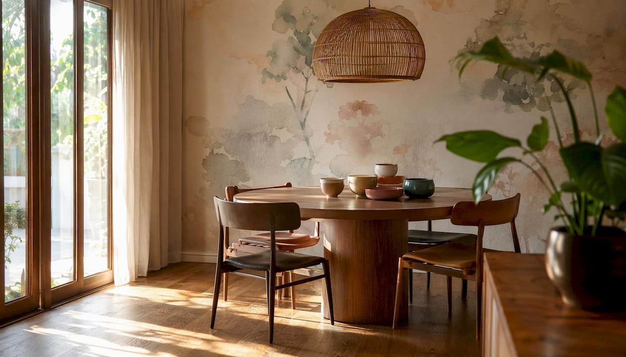
Lighting has a significant effect on how watercolor gradients read. Diffuse natural light preserves the translucent quality of the gradients; harsh directional light flattens them. Position watercolor walls near windows when possible, and use warm-toned ambient lighting in the evening rather than cool white spotlights.
Pro Tip: Let the watercolor mural breathe. Surround it with neutral, low-pattern surfaces — plain plaster, solid-color upholstery, unfinished wood — so the wall carries the visual weight without the room feeling cluttered. One strong watercolor feature reads as art; two competing ones read as noise.
For more on wallpaper styles for living rooms, Wallsneedlove’s guides cover room-specific recommendations in detail. Homeowners planning a broader renovation can also find useful context on integrating these design choices through full home remodeling resources that address how watercolor aesthetics fit into larger interior updates.
What to expect from a custom watercolor wallpaper provider
A quality provider offers more than a printed image on paper. The product options, material certifications, and support resources all affect the final result.
Typical offerings from a custom watercolor wallpaper provider:
- Removable (peel-and-stick) and traditional paste options for different installation needs and surface types
- Custom mural sizing to fit exact wall dimensions without awkward seams or cropping
- High-resolution printing that preserves fine gradient detail and color accuracy
- Matte, paper-grain textures that replicate the surface quality of watercolor paper
- UV and moisture-resistant finishes for durability in kitchens, bathrooms, and commercial spaces
- Greenguard Gold certified materials for low chemical emissions and safe indoor air quality
- Installation guides and sample ordering to test color and texture before full commitment
Wallsneedlove’s Greenguard Gold certified wallpaper collections meet strict low-emission standards, making them suitable for residential bedrooms, children’s rooms, and commercial interiors where air quality matters.
Surface preparation is often overlooked but directly affects the result. Testing wall absorbency and smoothness before installation is critical. Porous or heavily textured walls dull colors and break up smooth gradients. The ideal surface is primed, lightly sanded to a slightly toothy finish that mimics watercolor paper — smooth enough for clean adhesion, with just enough texture to hold the print’s depth.
Wallsneedlove’s watercolor wallpaper collections
Wallsneedlove offers custom watercolor wallpaper and large-scale murals printed to order, with most orders ready within 1–3 days. The collections include fluid abstract designs, scenic murals, and organic botanical patterns — all available in removable peel-and-stick or traditional paste formats. Every product carries Greenguard Gold certification, and the site provides detailed installation guides to support both first-time homeowners and professional decorators.
For a statement piece, the Java Mountain wall mural delivers the kind of large-scale, gradient-rich visual that defines the watercolor aesthetic at its most impactful. Samples are available to order before committing to a full installation, so you can check color accuracy and texture against your actual wall and lighting conditions. Browse the full range at Wallsneedlove to find the right style, size, and format for your space.
Key Takeaways
The watercolor wallpaper aesthetic works because it combines organic texture, muted color, and deliberate imperfection to create warm, human-centered spaces that sharp-edged or high-gloss styles cannot replicate.
| Point | Details |
|---|---|
| Defining characteristics | Soft gradients, organic bleeds, matte paper-grain textures, and muted natural tones. |
| 2026 design context | The Watercolor Pivot movement favors warm, fluid aesthetics over hard-tech, glossy design. |
| Room and styling tips | Use diffuse lighting, neutral furniture, and molding frames to maximize the mural’s impact. |
| Surface preparation | Prime and lightly sand walls to a smooth, slightly toothy finish before installation. |
| Wallsneedlove | Offers Greenguard Gold certified, custom-printed watercolor wallpaper with 1–3 day turnaround. |


Leave a comment