

10 Neutral Wallpaper Ideas for Quiet, Earthy Rooms in 2026
Tonal, low-contrast, textural wallpaper is the surest route to a calming and adaptable room, and designers point to fine linen effects and soft geometric lines as the formats that read as depth rather than noise, according to Emily Henderson. Order a peel-and-stick sample first and test it on your own wall before committing. We carry both peel-and-stick and traditional options if you want to start that process today.
TL;DR:
- Match pattern scale to the room: micro patterns recede in small spaces, while large motifs suit one wall in rooms with high ceilings.
- Tape samples to the wall and check them morning, midday, and evening; natural light shifts undertones, which should coordinate with flooring, trim, and furniture.
- Removable adhesive wallpaper suits renters, but its wall should have an eggshell, satin, or glossy finish, be cleaned gently, and dry for 24 hours.
- Bathrooms and kitchens need wallpaper rated to resist moisture, while textured grasscloth and linen finishes require gentler cleaning than smooth vinyl.
Table of Contents
- 1. Ten neutral wallpaper ideas worth trying
- 2. How texture, scale, and undertone change a room’s mood
- 3. How to choose neutral wallpaper for your room
- 4. Peel-and-stick vs traditional wallpaper: what to know before you hang
- 5. Where to use neutral wallpaper: a room-by-room guide
- 6. Why Walls Need Love for neutral wallpaper projects
- 7. Keeping neutral wallpaper clean and looking fresh
- 8. Combining neutral wallpaper with accent colors and decor
- 9. Personalizing neutral wallpaper with custom murals and variations
- 10. Sourcing environmentally certified neutral wallpaper
- 11. Trending neutral wallpaper designs and materials
- 12. Why quiet neutrals earn their place in a layered room
- 13. Ready to order samples and start your project
- FAQ
- Sources
1. Ten neutral wallpaper ideas worth trying
A good neutral wallpaper idea does two things: it sets a mood and it leaves room for everything else in the space to shine. Here are ten directions that cover most rooms and most tastes.
- Linen-effect textured wallpaper: works well in living rooms and entryways where you want warmth without pattern.
- Soft, low-contrast botanical silhouettes: suited to bedrooms and nurseries that need a gentle, restful backdrop.
- Tonal geometric lines: add quiet structure to a dining room or a single accent wall.
- Muted watercolor mural in neutral tones: makes a statement in a reading nook or behind a bed.
- Grasscloth or faux-grasscloth texture: brings warmth to studies and libraries.
- Subtle herringbone or chevron in a soft tone: elongates hallways and stairwells.
- Micro-scale pinstripe or dot: a quiet backdrop that pairs naturally with a gallery wall.
- Washed travertine or soft marble effect: works in bathrooms and powder rooms when you choose a moisture-resistant peel-and-stick version.
- Hand-drawn abstract in a single hue: fits modern living spaces that want one point of visual interest.
- Muted sage or dusty olive texture: a biophilic, calming choice that echoes the earthy neutral tones gaining ground this year, a direction Elle Decor ties to 2026 wellness-minded design.
2. How texture, scale, and undertone change a room’s mood
Neutral wallpaper falls into a few families, and knowing the difference helps you pick the right one. Tonal or monochromatic designs repeat a single hue at different values, so the pattern reads as shading rather than contrast. Low-contrast motif papers use a soft shape, like a botanical silhouette, printed close in value to its background. Texture-led neutrals, such as grasscloth or linen effects, skip pattern altogether and let the material itself carry the interest.
Scale matters as much as the design itself. A micro-scale pattern, like a fine pinstripe, tends to disappear into a wall and suits small rooms where you don’t want visual weight. Medium-scale patterns, such as a soft geometric line, hold their own on a larger wall without overwhelming it. Large-scale motifs, like an oversized botanical silhouette, work best as a single statement wall in a room with high ceilings or generous square footage.
Undertone is the detail most people miss. A warm beige with yellow or pink undertones will sit differently next to a cool gray sofa than it will next to warm wood furniture, and natural light shifts that relationship throughout the day.

3. How to choose neutral wallpaper for your room
A little homework before you order saves a return trip to the sample pile. Walk through these steps in order.
- Measure your walls and sketch a rough layout before ordering any samples.
- Tape samples to the wall and check them in morning, midday, and evening light, since undertones shift with natural light, a point Architectural Digest and Emily Henderson both make.
- Match the wallpaper’s temperature, warm or cool, to your existing flooring, trim, and furniture.
- Choose a moisture-resistant option for bathrooms and kitchens rather than a standard paper finish.
- If you’re using peel-and-stick, press a sample corner onto the actual wall to confirm it adheres cleanly before ordering a full roll.
4. Peel-and-stick vs traditional wallpaper: what to know before you hang
Peel-and-stick wallpaper skips the paste entirely, which makes it the more approachable choice for renters and first-time DIY installers. It tends to be removable and often moisture-resistant, though surface prep still determines how well it holds, according to Better Homes & Gardens. Walls need an eggshell, satin, or semi-gloss finish, a clean wipe with a non-abrasive cleaner, and a full 24 hours to dry before application, a step Trusscore treats as non-negotiable for adhesion.
Traditional paste-the-wall wallpaper handles heavier textures, like true grasscloth, and tends to deliver a more finished look for larger or more formal rooms. One step is essential here: booking, where pasted paper is folded onto itself briefly so it can absorb the paste evenly before hanging, a detail covered in how to hang wallpaper.
Whichever route you pick, avoid stretching the material to force a seam match, since tension causes pull-away later, a common mistake flagged by Homedit.
Pro Tip: Order a sample before the full roll. It reveals undertone shifts under your own lighting and tells you how the adhesive behaves on your actual wall.

5. Where to use neutral wallpaper: a room-by-room guide
Each room asks something different of a neutral wallpaper. In the bedroom, a tonal, low-contrast paper behind the bed creates a restful focal point without competing with bedding or art. In the living room, you can go two ways: wrap the whole room in a quiet texture, or save the pattern for one wall behind the sofa to anchor the seating area, a strategy covered in our living room wallpaper guide.
A dining room can handle a medium-scale pattern in a warm neutral, which adds formality without shouting, something we explore further in our dining room wallpaper ideas. In an entry or hallway, a narrow vertical texture or herringbone line elongates a tight space and makes it feel taller. Bathrooms call for a moisture-resistant peel-and-stick option, paired with simple trim so the paper stays the focal point rather than competing with hardware.
If you’re coordinating trim and doors alongside new wallpaper, matching finishes across both makes the whole room read as one decision instead of two, a point echoed in door design trends worth a look before you finalize paint or stain choices.
6. Why Walls Need Love for neutral wallpaper projects
We offer both peel-and-stick and traditional wallpaper, custom sizing for nonstandard walls, and Greenguard Gold certified inks, and our custom orders are typically produced promptly. These are practical details to consider as you decide on a style.
If you’re still deciding between formats, our installation guides walk through surface prep and hanging steps for both peel-and-stick and paste options, and ordering a sample is the fastest way to confirm color, texture, and adhesion before committing to a full room.
7. Keeping neutral wallpaper clean and looking fresh
Neutral wallpaper shows dust and marks more visibly than a busy pattern would, simply because there’s less going on to distract the eye. A light, regular approach keeps it looking new.
For most peel-and-stick and vinyl-faced papers, a soft microfiber cloth and plain water handle everyday dust. For small marks, a barely damp cloth with a mild, non-abrasive cleaner works, but test it on a hidden corner first, since textured finishes like grasscloth or linen-effect papers can be more sensitive to moisture than smooth vinyl. Avoid soaking the surface or scrubbing hard, which can dull the texture or lift an edge on peel-and-stick material.
Kitchens and bathrooms benefit from a quick wipe-down weekly, since grease and condensation build up faster in those rooms. In lower-traffic spaces like bedrooms, a monthly dusting with a vacuum brush attachment is usually enough. Fading from direct sun is the other thing to watch for in neutral tones, since color shifts are more visible against a quiet palette than a busy one, so curtains or UV-filtering window film help protect a wall that gets strong afternoon light.
8. Combining neutral wallpaper with accent colors and decor
Neutral wallpaper is a backdrop, not the finished room. The easiest way to add personality is through textiles: a few pillows or a throw in rust, deep green, or muted blue will stand out clearly against a tonal or texture-led wall. Monochromatic backgrounds let furniture and sculptural pieces read more clearly, since there’s no competing pattern pulling attention away, a point Architectural Digest makes about layering neutral spaces.
Art is the other lever. A neutral wall is the ideal gallery backdrop because frames and colors in the art itself become the visual anchor instead of fighting a patterned wall for attention. Metallic accents, in brass or aged bronze hardware, warm up a cooler neutral without adding another color to balance. If your wallpaper leans warm, like a sage or dusty olive texture, pull one or two of those same undertones into cushions or a rug so the room feels intentional rather than accidental.
Curtains and drapery are an easy way to extend the palette further; a faux linen panel in a complementary neutral, like those from Drapery Company, softens a room without introducing a second competing texture.
9. Personalizing neutral wallpaper with custom murals and variations
A standard neutral pattern works for most rooms, but a custom mural lets you scale a design to an exact wall, which matters most in rooms with unusual dimensions, like a stairwell or a room with angled ceilings. We offer custom wall murals sized to your specific wall rather than a standard roll width, which avoids awkward seams or leftover strips.
Color adjustments are another form of personalization: the same botanical silhouette or geometric line can be printed in a warmer or cooler neutral to match your existing finishes more closely than an off-the-shelf option would. For a reading nook or a single statement wall, a muted watercolor mural gives you one large-scale image instead of a repeating pattern, which reads as art rather than wallpaper.
If you want a nature-rooted feel without going fully botanical, our biophilic wallpaper options apply that same custom-sizing approach to earthy, organic designs.
10. Sourcing environmentally certified neutral wallpaper
Indoor air quality is worth checking before you commit to covering an entire wall, especially in a bedroom or nursery where you spend hours at a time. Greenguard Gold certification specifically evaluates chemical emissions and sets stricter limits for products used around children, which is why it’s worth confirming before ordering a large quantity of any wallpaper.
Material matters too. Vinyl and PVC-based wallpapers are common in budget lines, but vinyl-free alternatives avoid some of the off-gassing concerns tied to PVC production. Check the material and certification details for the specific wallpaper before you start browsing patterns.
If certification is a priority for your project, ask for documentation before ordering a full room’s worth of paper, not just a sample swatch, since some sellers only certify select product lines rather than their full catalog.
11. Trending neutral wallpaper designs and materials
The neutral palette itself is shifting warmer. Sherwin-Williams named Universal Khaki, a sanded, warm neutral, its 2026 Color of the Year, a signal that beige is moving away from cool gray undertones and toward tones that pair naturally with layered textures, according to Architectural Digest. Benjamin Moore’s 2026 palette leans the same direction, highlighting mid-tone neutrals designed to work as either a full-room wash or a tasteful backdrop, per Architectural Digest.
Designers report a broader move away from cooler “millennial gray” toward richer, sun-soaked tones: browns, rusts, and muted greens with visible texture, a shift Elle Decor ties to 2026 interiors. Earthy, nature-inspired neutrals, like sage and warm tan, continue to align with biophilic design, supporting the quieter, indoor-outdoor feel many homeowners are after this year. For a closer look at how these shifts show up in specific patterns, our wallpaper trend roundup walks through current directions.
12. Why quiet neutrals earn their place in a layered room
We keep coming back to tonal neutrals for one reason: they let everything else in a room do the talking. A sage grasscloth wall behind a single bold piece of art works because the wall gets out of the way. Order a sample, tape it up, and live with it for a few days before deciding.
— WallsNeedLove
13. Ready to order samples and start your project
Browse our wallpapers collection or go straight to peel-and-stick removable wallpaper if you want a renter-friendly start. Every custom order is made to fit your wall.
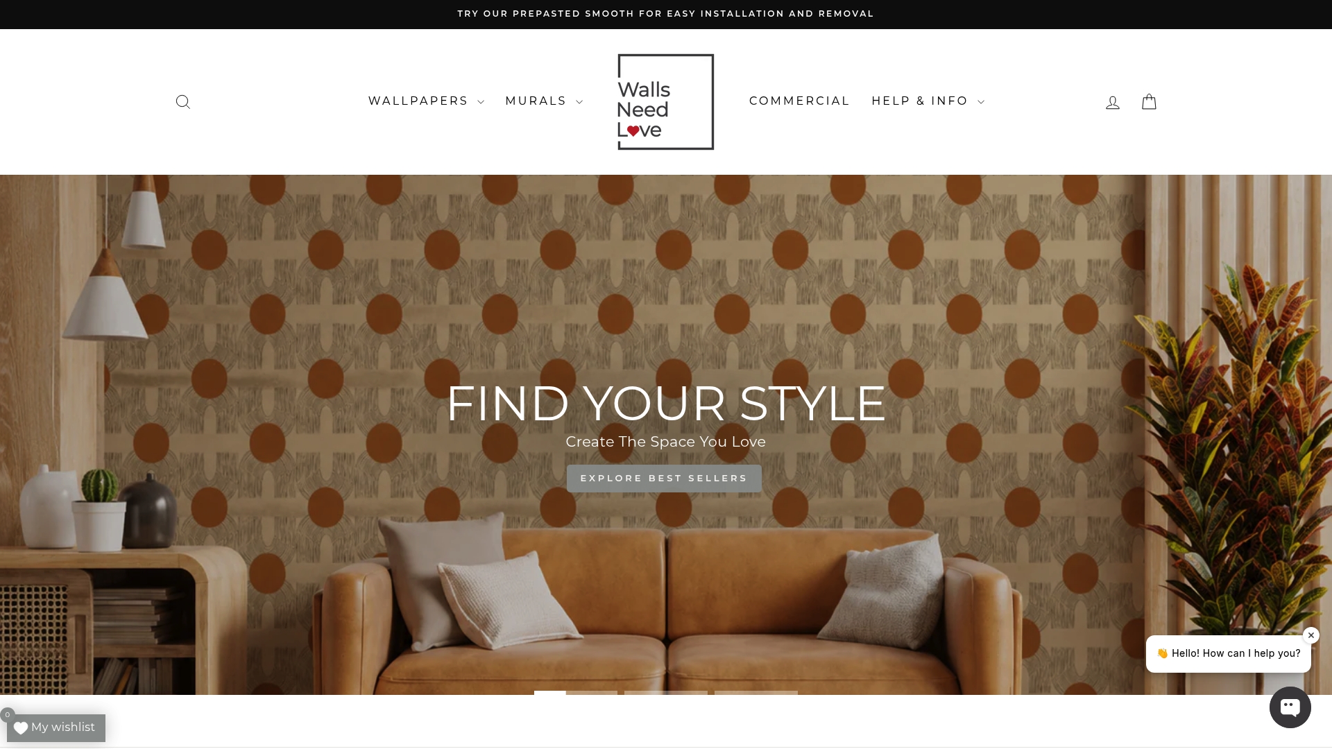
Order a sample today and see how it reads on your own wall before you commit to a full roll.
FAQ
What type of wallpaper is in style now?
Warmer, texture-led neutrals are leading current trends, including linen effects, grasscloth, and sanded tones like Universal Khaki. Designers are moving away from cool gray toward richer, earthy midtones with visible texture.
What are some neutral decor styles?
Common neutral decor styles include tonal and monochromatic schemes, low-contrast botanical or geometric motifs, and texture-led looks like grasscloth or linen effects. Each works differently depending on room scale and existing furnishings.
What is the easiest wallpaper to put up?
Peel-and-stick wallpaper is generally easier to hang than traditional paste versions, since it skips paste entirely and is often removable, according to Better Homes & Gardens. Proper wall prep, including a smooth finish and full drying time, still matters for a clean result.
What is the most calming wallpaper?
Tonal, low-contrast, and texture-led neutral wallpaper tends to feel the most calming, since it adds depth without competing patterns or high contrast, a point Emily Henderson makes about quiet neutral design. Soft botanicals, fine linen textures, and muted geometric lines are common examples.
Sources
- The Case For The Quiet Neutral Wallpapers - Emily Henderson
- Is Peel-and-Stick Wallpaper Actually Easier to Hang? How It Compares to Traditional Versions
- Trusscore
- These Are the Wallpaper Trends Taking Over in 2026, According to Experts


Leave a comment