

Weekend Accent Walls in 1–3 Days: Mid Century Wallpaper Ideas
The easiest way to get an authentic look is to treat wallpaper as the room’s art. Pick one accent wall or a small room, then commit to a single mid-century pattern family: geometric or atomic starburst, retro floral, or organic botanical. Keep the colorway restrained, and choose peel-and-stick or traditional paste based on how long you plan to keep it. Both peel-and-stick and traditional paste formats are available across curated mid-century-style collections.
TL;DR:
- Using a single pattern family, such as starburst or geometric grid, on one accent wall enhances a mid-century modern look without overwhelming the space.
- Proper scale and placement are essential, with large botanicals best behind the headboard and small repeats suitable for narrow hallways or powder rooms.
- Peel-and-stick wallpaper is ideal for rentals and short-term projects, while traditional paste options offer greater durability in high-traffic areas.
- Testing samples against the wall in different lighting helps prevent color and scale surprises before fully committing.
- Opt for muted, tonal colorways in mustard, teal, olive, or cream to maintain authentic mid-century warmth and avoid a costume-like appearance.
Table of Contents
- Mid Century Wallpaper Ideas That Actually Work in Real Rooms
- Room-by-Room: Matching Scale to Space
- Peel-and-Stick vs. Paste: Choosing the Right Material
- Styling Rules That Keep Bold Patterns Livable
- Why Wallsneedlove Fits Mid-Century Wallpaper Projects
- Durability and Maintenance for Retro-Style Wallpaper
- Mixing Mid-Century Wallpaper with Other Interior Styles
- Best Colors for Mid-Century Wallpaper
- Sourcing Authentic Vintage-Style Wallpaper
- Treat Wallpaper Like Art, Not Wall-to-Wall Decoration
- Ready to Choose Your Wallpaper? Here’s the Fast Path
- Sources
Mid Century Wallpaper Ideas That Actually Work in Real Rooms
Mid-century modern decor built its identity on pattern with purpose. Nothing was busy for the sake of busy. Every starburst, grid, or stylized leaf had a job: add rhythm without fighting the furniture. That’s the standard to hold any retro wallpaper trend against today, and it’s why the strongest mid century wallpaper ideas share one trait. They pick a single motif and let it do the talking.
Here are the concepts worth stealing, organized by pattern type and placement.
-
Starburst behind the sofa or media wall. An atomic starburst in a tonal colorway, think muted gold on taupe, or charcoal on cream, reads as sculptural rather than loud. Tonal versions of atomic motifs keep the retro energy while staying easy to live with next to walnut furniture.
-
Muted geometric grid for a dining room or study. A repeating grid pattern echoes the linear legs and clean edges of mid-century case pieces. Keep the contrast low so the wall supports the furniture instead of competing with it.
-
Oversized abstract botanical in the bedroom. Scale up a leaf or branch print and let it wrap the headboard wall. Large-scale botanicals in warm, muted tones create a calm backdrop for sleep.
-
Small-scale retro floral in a hallway or powder room. A tight repeat in the 1950s wallpaper patterns style, think stylized tulips or fan shapes, works because the space is contained. Bold prints belong in small rooms precisely because there’s less wall to overwhelm.
-
Grasscloth or faux wood texture in the living room. Texture reads as neutral but still nods to mid-century material culture. It’s a smart move if your furniture already carries a lot of visual weight in teak or walnut tones.
-
Chevron or repeat arch in an entryway. A directional pattern in a stairwell or hallway can guide the eye and make a transitional space feel intentional instead of like leftover square footage.
-
Playful patterns, scaled down, in a kids’ room. Bright color is fine here, but keep the palette limited to two or three hues so the room doesn’t feel chaotic. A botanical mural with a playful theme works well when the rest of the room stays simple.
-
A full mural as a statement wall. Scenic, all-over designs work in nurseries and dining rooms where you want one wall to carry the whole room’s personality.
-
Two-pattern mix: bold accent plus coordinating neutral repeat. Pair a dominant motif with a second pattern at least one scale smaller, and pull one repeating color across both. That shared color is what keeps a mix from looking accidental.
-
Peel-and-stick feature wall for a rental. Renters and short-term homeowners can commit to a bold atomic or geometric print knowing it comes down clean at move-out.
Pro Tip: Before you fall for a pattern online, order a physical sample and tape it to the wall for 48 hours. Colors shift dramatically under morning light versus lamp light, and a screen never tells you the truth about scale.
Room-by-Room: Matching Scale to Space
The right pattern in the wrong room still looks off. Scale and placement matter as much as the motif itself.
- Living room: Use an accent wall behind the sofa. Medium- to large-scale geometrics or subtle grasscloth pair well with low-slung mid-century seating without visually crowding it.
- Bedroom: Large botanicals or softened geometric patterns behind the headboard create a restful focal point. Stick to muted palettes here over anything high-contrast.
- Powder room: This is the one spot in the house built for drama. A punchy starburst or high-contrast geometric feels intentional in a small, enclosed space.
- Kitchen: Smaller repeats or textured papers work best on backsplashes or alcove walls. Save loud, large-scale patterns for rooms that aren’t open to the rest of the house.
- Hallway or entry: Smaller-scale repeats read cleanly in narrow spaces and help set the tone as people move through the home.
Peel-and-Stick vs. Paste: Choosing the Right Material
Material choice comes down to how long you’re staying and how much wear the wall takes. Peel-and-stick wallpaper is renter-friendly and simple to remove, which makes it the obvious pick for accent walls, rentals, or any space you might repaint next year. Retailer guides consistently position peel-and-stick as the low-commitment option for exactly that reason.
Traditional paste or non-woven wallpaper holds up better in high-traffic zones and gives large murals a seamless finish without visible seams breaking up the scene.
Grasscloth and faux wood options add tactile warmth but come with a catch: natural fiber grasscloth shows slight variation panel to panel, so order enough from one production run.
- Order two or three samples, not one, so you can compare options side by side.
- Test samples against the wall in morning and evening light before committing.
- Use a room visualizer where available to check how a pattern reads at full scale, since samples and visualizers reduce the odds of buyer regret after installation.
- If you’re working against a deadline, look for a supplier with fast custom production, since some tight timelines don’t leave room for a two-week wait.
Styling Rules That Keep Bold Patterns Livable
Designers who work with vintage-inspired prints follow a short list of rules, and most mistakes trace back to breaking one of them.
- Limit pattern to one focal wall. Full-room wallpaper only works in genuinely small spaces like powder rooms or nooks.
- Repeat two colors from the wallpaper elsewhere in the room. Pull a hue into a throw pillow, a lampshade, or a chair to create flow between the wall and the furnishings.
- Choose tonal, low-contrast colorways for bold motifs. A starburst in navy-on-navy feels current; the same shape in black-on-white can feel dated fast.
The most common mistakes: stacking two competing prints without a shared color, ignoring scale relative to the room, and mixing warm wood tones with cool-toned wallpaper that fights the furniture instead of complementing it.
Pro Tip: If you’re nervous about commitment, start with one wall in the smallest room in your house. It’s the lowest-risk way to learn how a bold pattern actually feels to live with.
Why Wallsneedlove Fits Mid-Century Wallpaper Projects
Curated collections in geometric, retro floral, and organic botanical styles are available in both peel-and-stick and traditional paste formats. Custom orders can be produced quickly, which matters when working around a moving date or a room refresh deadline. Many products are Greenguard Gold certified, and collections often include work from independent artists, fitting custom murals, renter-friendly updates, and quick-turn accent walls equally well.
Durability and Maintenance for Retro-Style Wallpaper
Different materials age differently, and mid-century patterns often show wear in specific ways because of how they’re used.
Peel-and-stick wallpaper handles humidity reasonably well in bathrooms and kitchens, but it’s not built for constant moisture exposure like a shower surround. Wipe it down with a damp cloth and mild soap rather than harsh cleaners, which can degrade the adhesive backing over time.
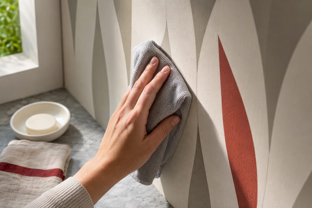
Traditional paste-applied paper lasts longer in high-traffic hallways and living rooms because the seams bond more securely and the surface resists scuffing better. It’s the better choice behind a sofa or in an entryway where bags and furniture brush against the wall regularly.
Grasscloth and other textured papers need the most care. Natural fibers absorb moisture and stain more easily than vinyl-coated prints, so keep them away from kitchens and bathrooms. Dust with a soft brush rather than a wet cloth.
Faux wood grain and other printed textures hold color well under normal indoor light, but direct sun exposure over years can fade any wallpaper. If your accent wall sits opposite a large window, rotate expectations accordingly, or choose a spot with indirect light for your boldest print.
Sun fading and moisture are the two real threats to any retro wallpaper trend. Match the material to the room’s actual conditions before you fall in love with a pattern.
Mixing Mid-Century Wallpaper with Other Interior Styles
Mid-century patterns don’t require a fully mid-century room. They mix well with several current interior styles when you handle the supporting pieces carefully.
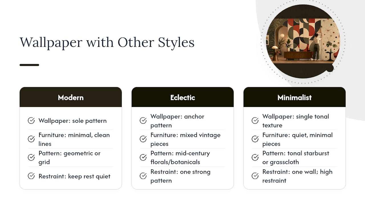
In a modern space, let a geometric or grid wallpaper stand in for the room’s only pattern. Keep furniture minimal and let clean lines echo the wall’s structure.
In an eclectic room, mid-century florals or botanicals become the anchor a mixed collection of furniture needs. Vintage pieces from different decades tend to look more cohesive against one strong, period-appropriate pattern rather than a bunch of small accessories fighting for attention.
In a minimalist space, a single tonal starburst or subtle grasscloth adds warmth without adding visual noise. This is where restraint matters most: one pattern, one wall, and everything else stays quiet.
The throughline across all three: mid-century wallpaper works as a bridge between styles when it’s treated as the room’s single statement, not one of several competing decisions. If you’re furnishing a room from scratch, pick the wallpaper first and build the rest of the palette around it rather than trying to match paper to furniture you already own.
Best Colors for Mid-Century Wallpaper
The mid-century wallpaper palette draws from a specific, recognizable set of tones, and getting the colors right does more to sell the look than the pattern itself.
Mustard and gold carry the era’s warmth and pair naturally with walnut and teak furniture. Teal and avocado green were kitchen and living room staples in the 1950s and 1960s, and they still read as period-accurate without feeling costume-like when used in muted, tonal versions. Olive works as a grounding neutral that plays well with both warm woods and brass fixtures.
Walnut and burnt orange tones show up frequently in botanical and abstract prints, echoing the wood furniture the style is known for. Cream and charcoal act as the neutral backbone, letting a bold color like mustard or teal pop without overwhelming a room.
The unifying rule across all of these: tonal, muted versions of any mid-century color read as current. The same hue at full saturation and high contrast can tip into costume territory fast. If you want a mustard starburst, look for a version rendered in tonal gold-on-cream rather than gold-on-white with sharp black outlines.
Sourcing Authentic Vintage-Style Wallpaper
True vintage wallpaper, actual rolls printed in the 1950s or 1960s, is rare, often discontinued, and can carry lead-based ink concerns depending on age and manufacturer. Estate sales, architectural salvage shops, and specialty vintage dealers occasionally carry genuine period rolls, but quantities are usually too limited to paper an entire room.
For most homeowners, the more practical route is sourcing wallpaper designed in an authentic mid-century style rather than hunting down original stock. Look for collections that reference specific design elements. Grid repeats, atomic motifs, and stylized botanicals rendered in period-accurate colorways deliver the same visual result without the supply and safety concerns of decades-old paper. This is also where custom printing has an advantage: you can request a specific colorway or scale adjustment that vintage stock simply can’t offer.
Treat Wallpaper Like Art, Not Wall-to-Wall Decoration
The strongest mid-century rooms pick one wall and one pattern, then stop. A starburst behind a simple credenza with two matching lamps does more than a room where every surface competes for attention. Order a sample before you commit, live with it on the wall for a few days, and adjust if the scale feels off once it’s actually up.
— Wallsneedlove
Ready to Choose Your Wallpaper? Here’s the Fast Path
Once you’ve picked a pattern family, the next step is simple: order a sample before you order the roll. A seamless geometric print or a tonal starburst can look completely different against your actual wall color and lighting than it does on a screen.
Wallsneedlove ships custom orders in 1 to 3 days, so a weekend accent wall project doesn’t turn into a month of waiting. Every roll is Greenguard Gold certified, which matters if you’re papering a bedroom or nursery. Browse the geometric texture collection for grid-based patterns, or check the Art Deco City design if you want something with more graphic punch. If your room needs one big statement instead of a repeating pattern, the Java Mountain mural shows how a scenic wall works as the room’s only decoration. Order your sample today and see how the color reads on your actual wall before you commit to the full room.
Sources
- Atomic Wallpaper for Your Home — Atomic Ranch
- What Wallpaper Patterns Work Best To Complement A Mid Century Modern Aesthetic — Edward Martin
- 67 Best Mid Century Wallpaper ideas — Pinterest


Leave a comment