5 Nursery Design for Modern Babies and Their Parents
Look up the latest design blogs and you see a lot of simplicity—something that doesn’t normally mesh well with the nursery. Where's the simplicity in tripping over tummy time blankets, 2AM feedings, smelling of dirty diapers, and drowning in onesies. Isn’t that what motherhood is like?
Ok, well maybe it’s not that bad, but the fact is that good modern design can mesh with your maternal side. Babies need the same things that adults need: colors, shapes and lines for visual stimulation and textures and patterns for tactile stimulation. Maybe all you need is a little inspiration to get your nursery designs started:

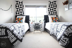
2. Start small. Modern design tends toward pared down and clean rather than overstuffed and cluttered, which is good for the nursery! You want your baby’s room to be a soothing place for sleeping, not over-stimulating. Simplicity of design means you can focus on a few main colors (2-3 at the most!) and let incidentals like books, toys, and pillows or blankets bring in some brightness for you. In this boy's room from Nest Design Studio (via Design to Inspire), the base is black and white, and secondary objects bring in pops of color, giving the room a graphic yet soothing effect.

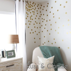
3. Keep it simple. Life complicates itself without putting a whole lot of junk into your design. A few wall stripes, some polka dots or triangle wall decals, or just a few cute framed pictures on a white wall can be enough for you and baby to enjoy the room together. Remember that much of a nursery's life happens in a chair or on the floor, so don't forget to keep those areas in mind when you're designing, as it's easy to focus completely on the walls. Look to the August-September 2014 issue of Adore Home Magazine for more amazing ideas like these:

Need some more visual inspiration? Head over to some of our faves:
A Beautiful Mess—wonderful DIY and design advice
Design Seeds—color combos for inspiration and Fresh Hues for browsing


Leave a comment